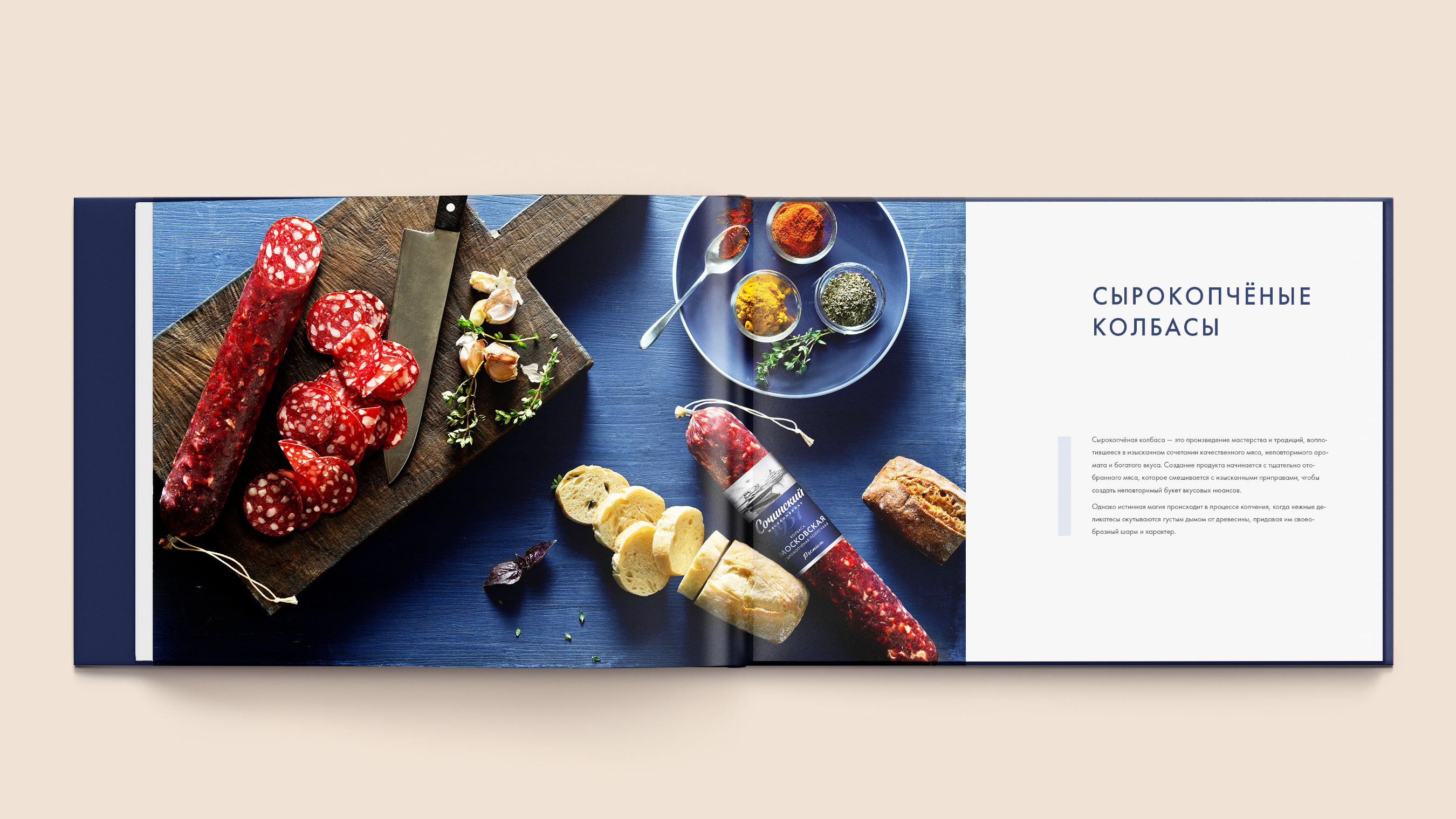
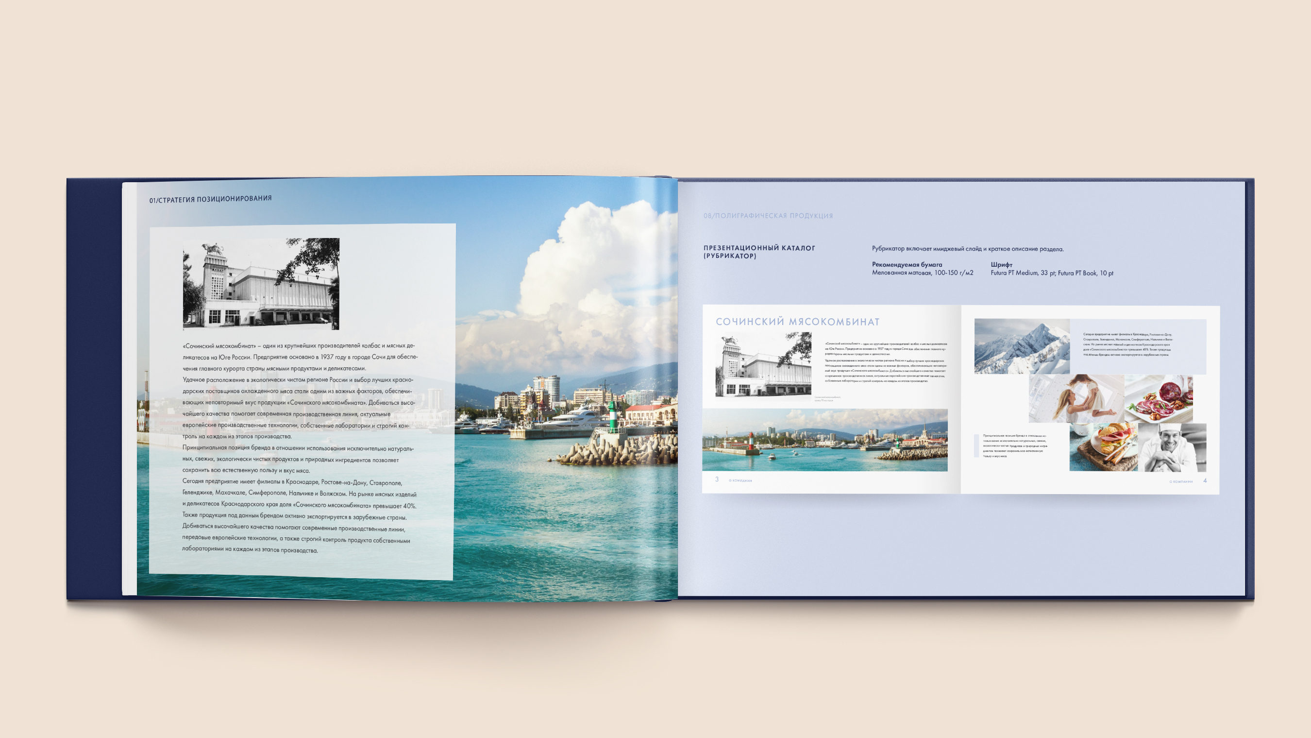
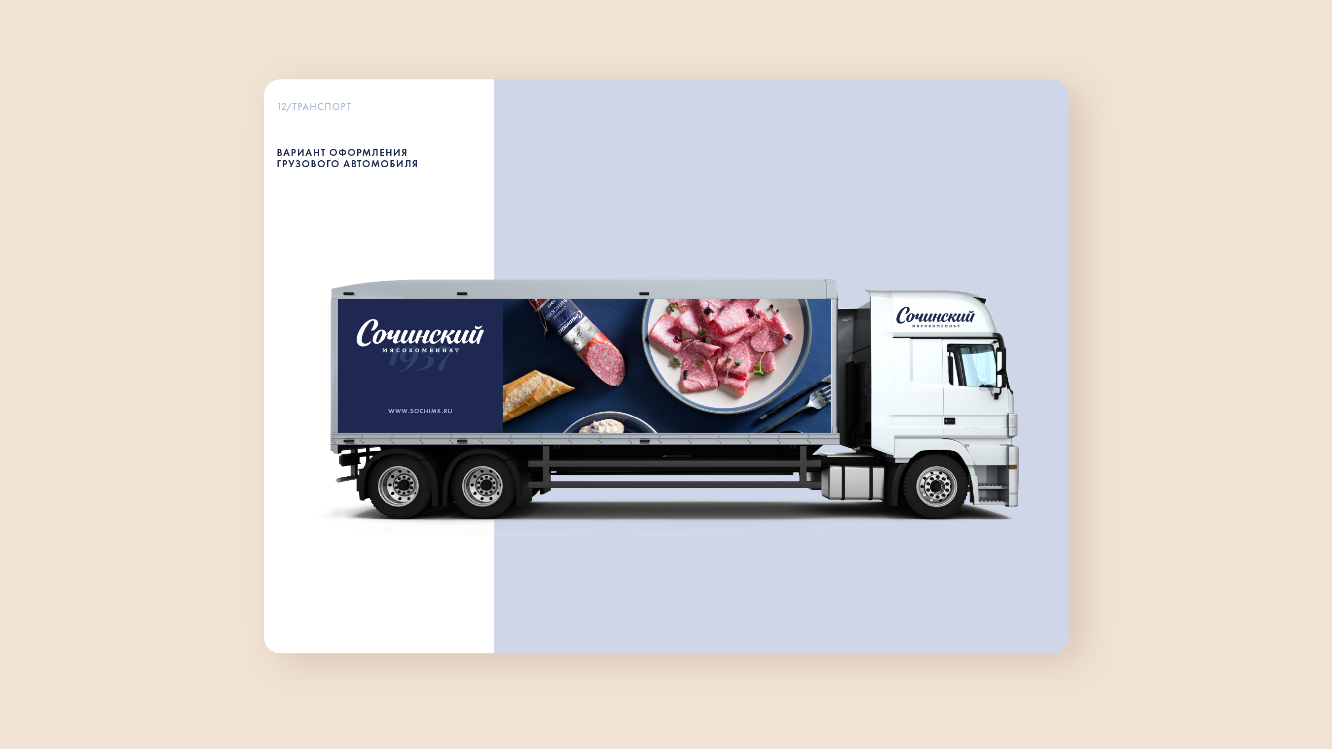
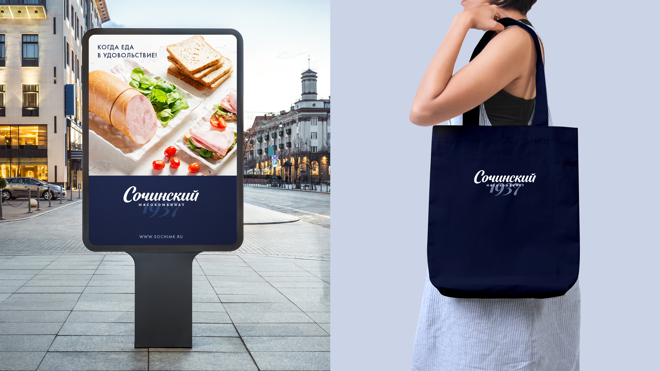
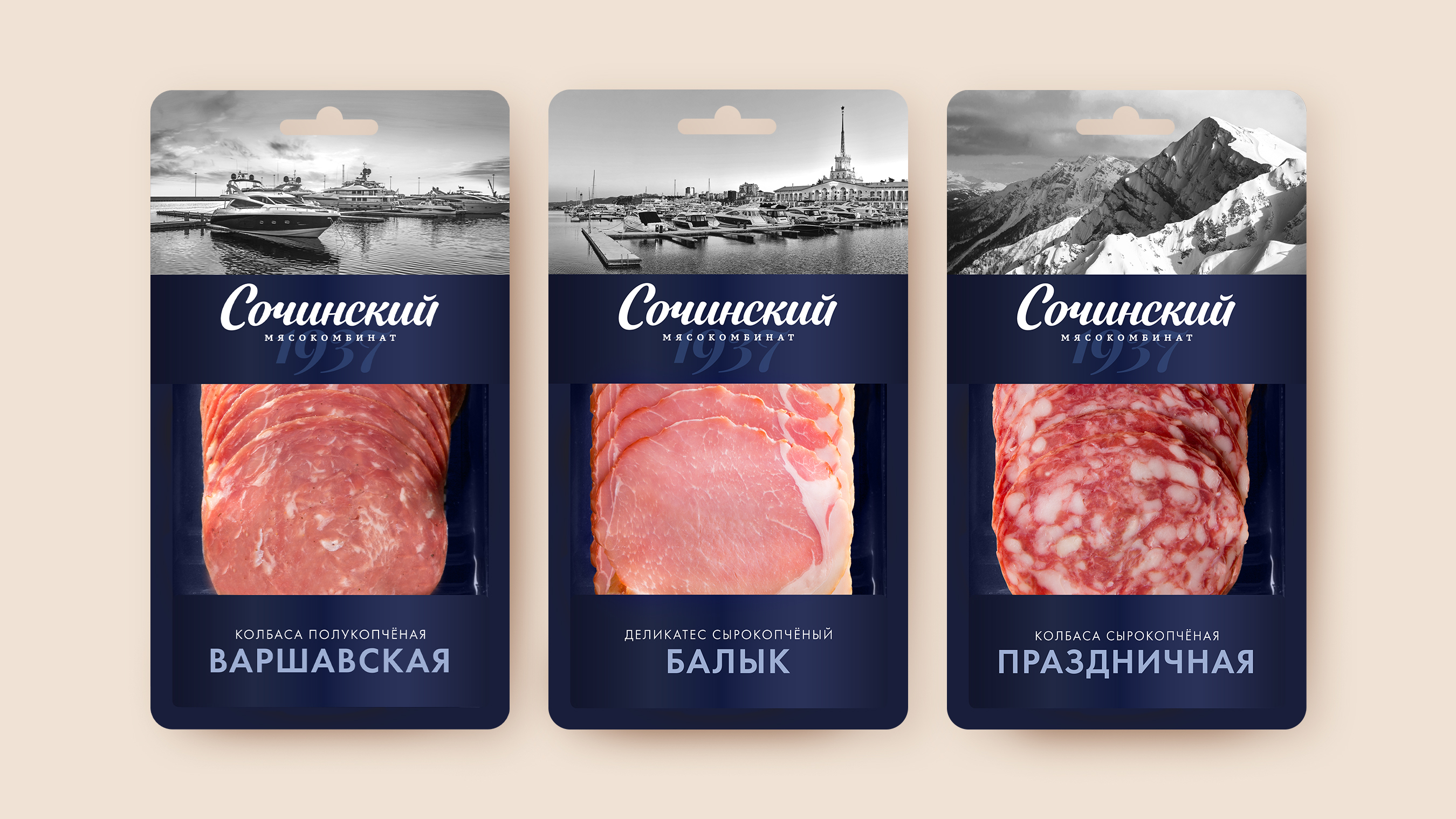
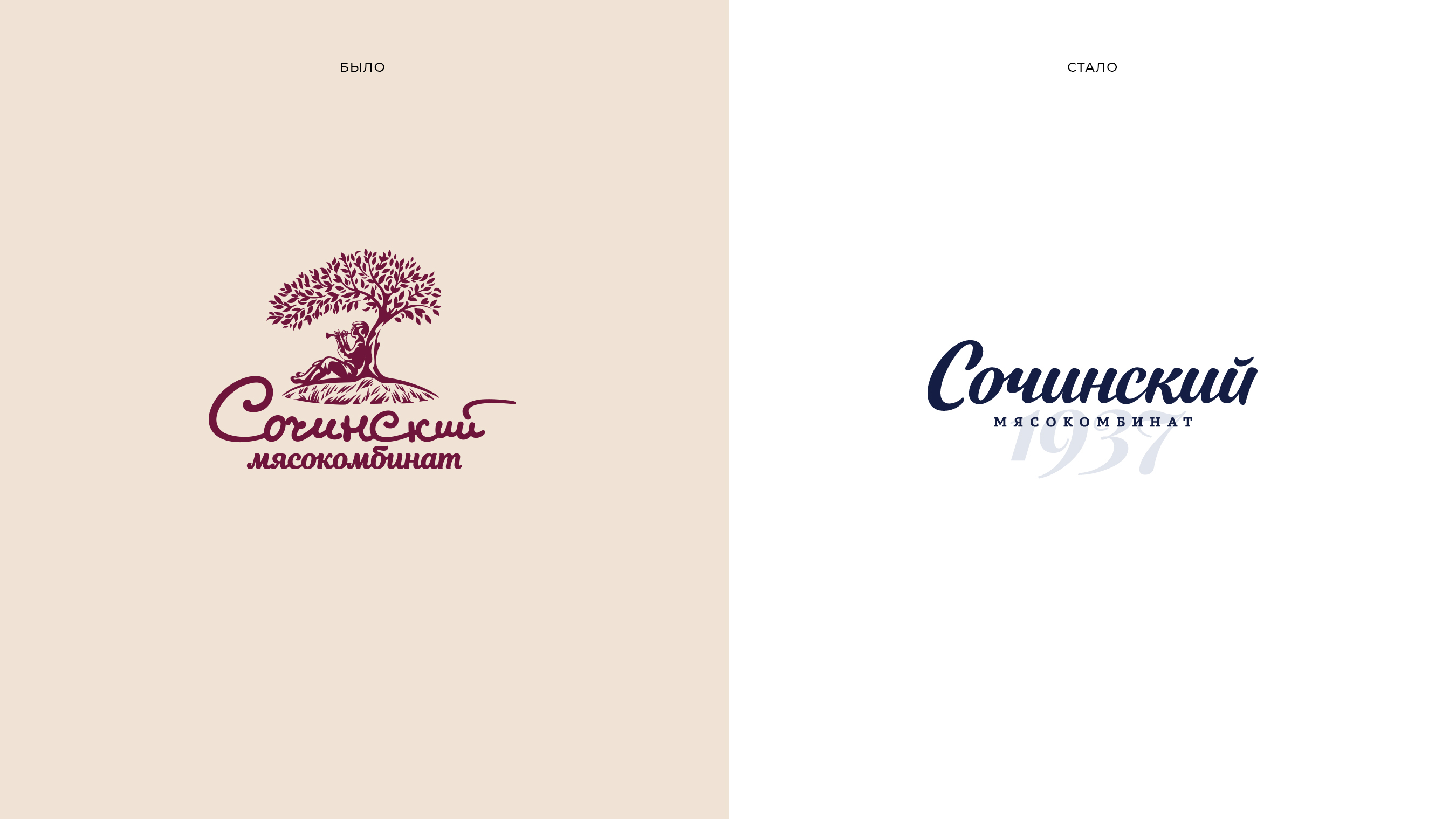
BRANDEXPERT agency conducted the rebranding of "Sochinsky Meatworks," the largest producer of delicatessen meats and sausages in southern Russia. The project included developing the logo and corporate identity, as well as packaging design. Professional product photography was used to create unique visual communications for the brand, forming the basis for catalogs and advertising materials. Brand management guidelines and positioning strategy were compiled into a comprehensive brand book. Located in the environmentally pristine region of Krasnodar, the company upholds high production quality standards.


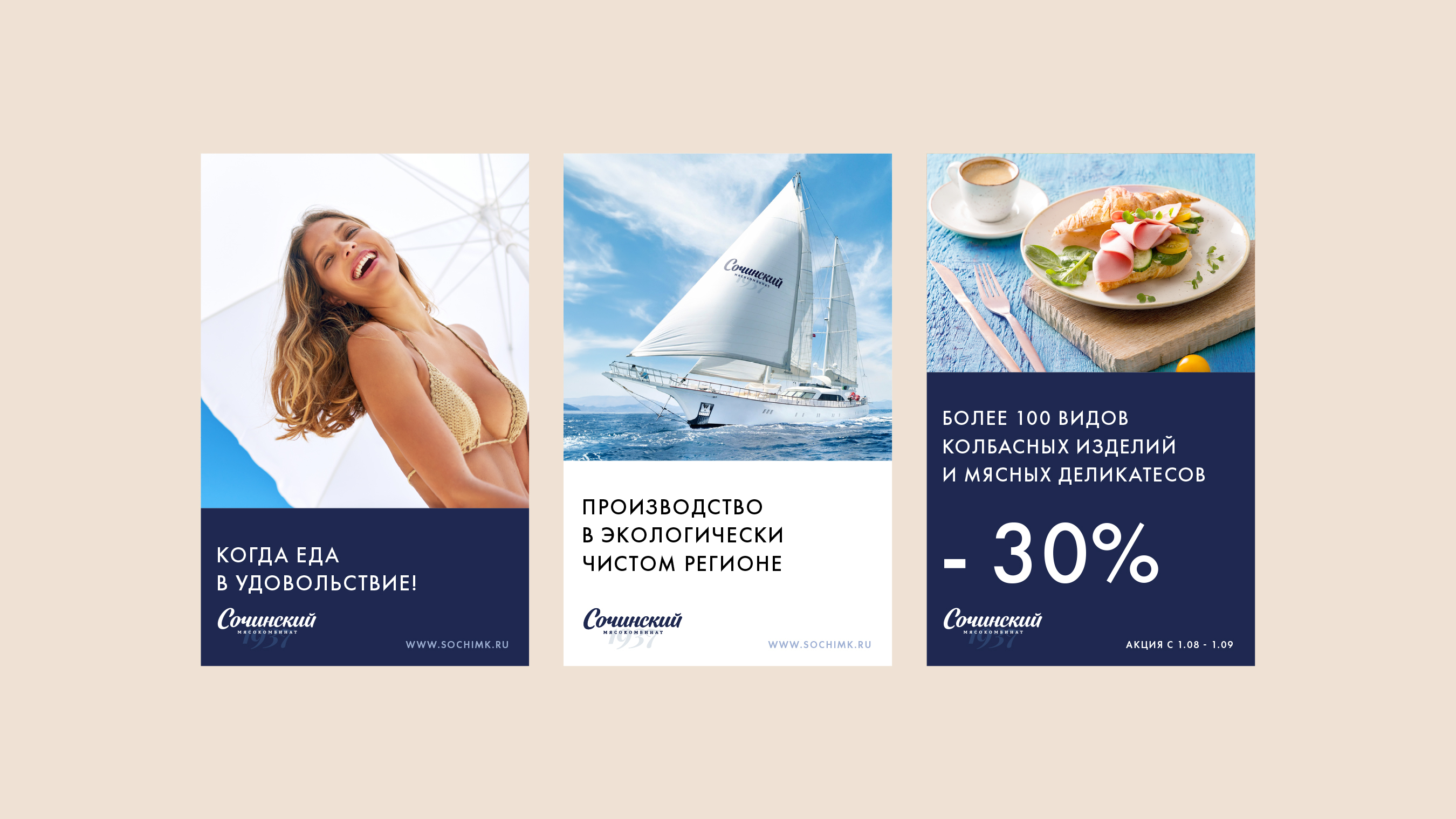
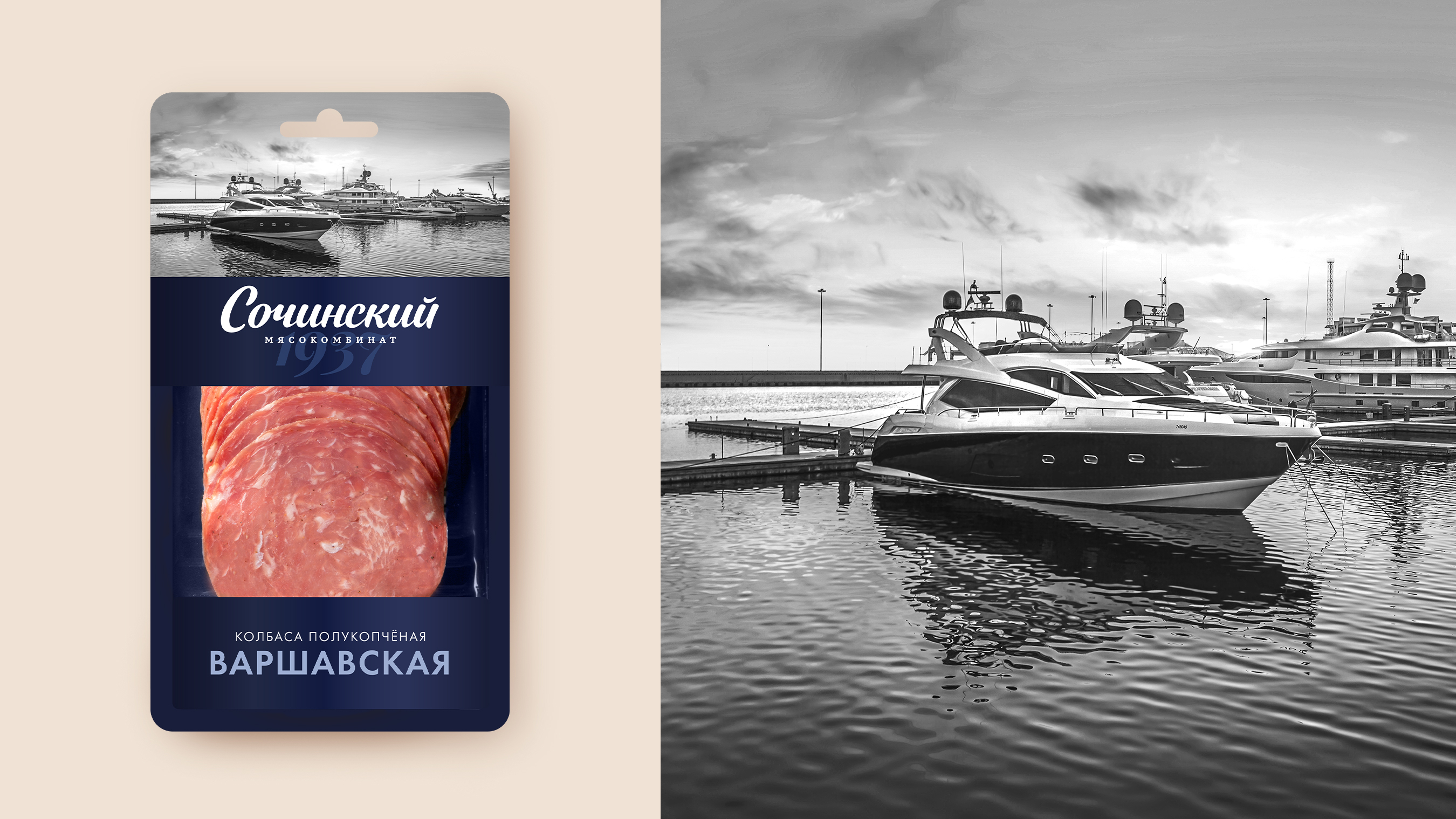
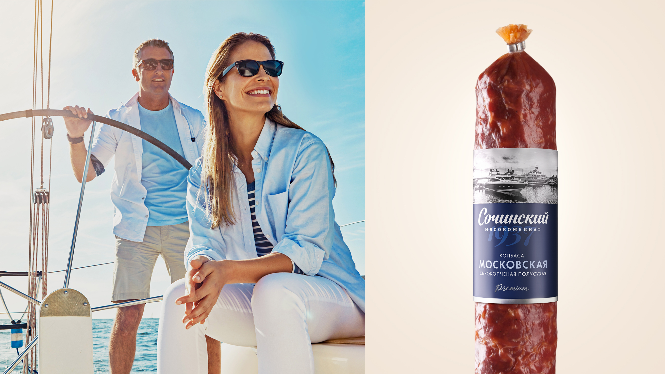
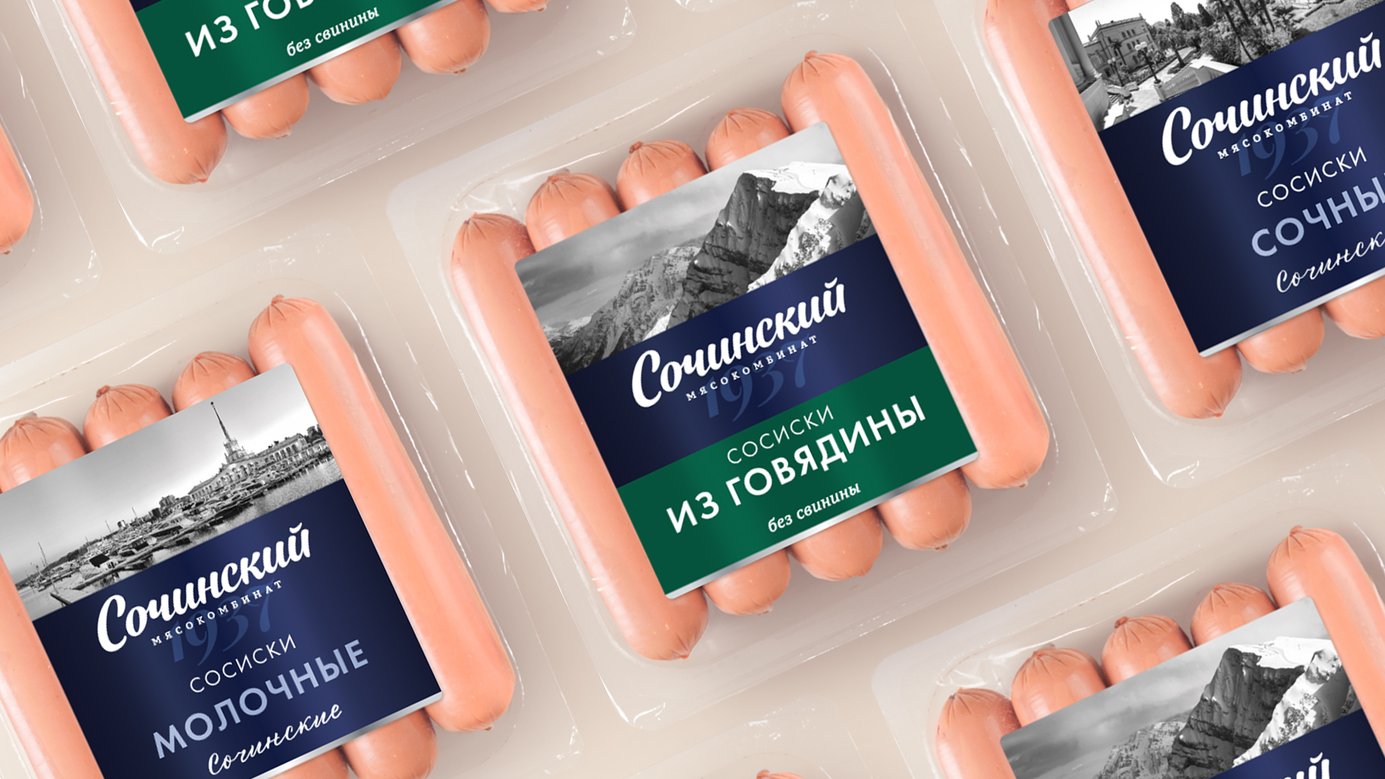
The rebranding is based on globally recognized symbols of the resort city of Sochi: famous architectural landmarks, thematic images of beach holidays and ski resorts and yachting. These images evoke warm, positive associations and create a strong emotional connection to the brand.
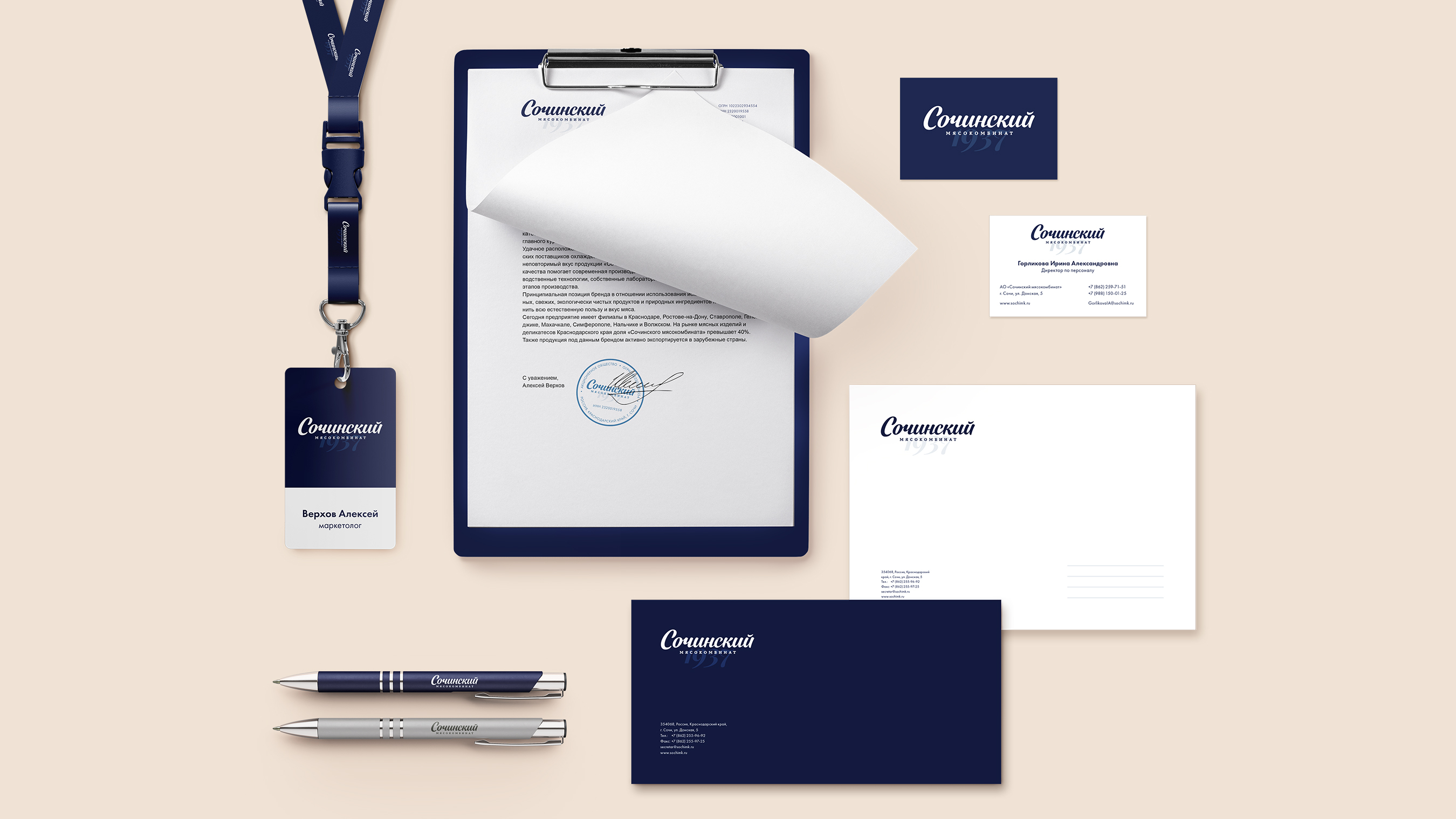
The brand-defining shades of blue are associated with vast ocean expanses, conveying a sense of freedom and independence. Blue also evokes elegance, reliability, stability and professionalism.
Within the brand, there is also a halal product line distinguished by a green shade, signifying compliance with religious norms and principles.

The snack range of cured sausages embodies a modern design approach featuring a graphic pattern inspired by Sochi landmarks. The revitalized visual style, capturing the Olympic Park and other iconic landmarks, gives the product packaging a unique and memorable appearance.

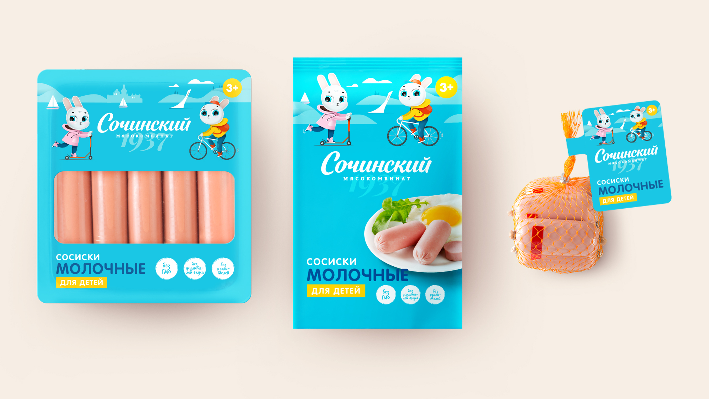
The children's product line features a bright color palette and logo characters, making the brand appealing to young consumers.
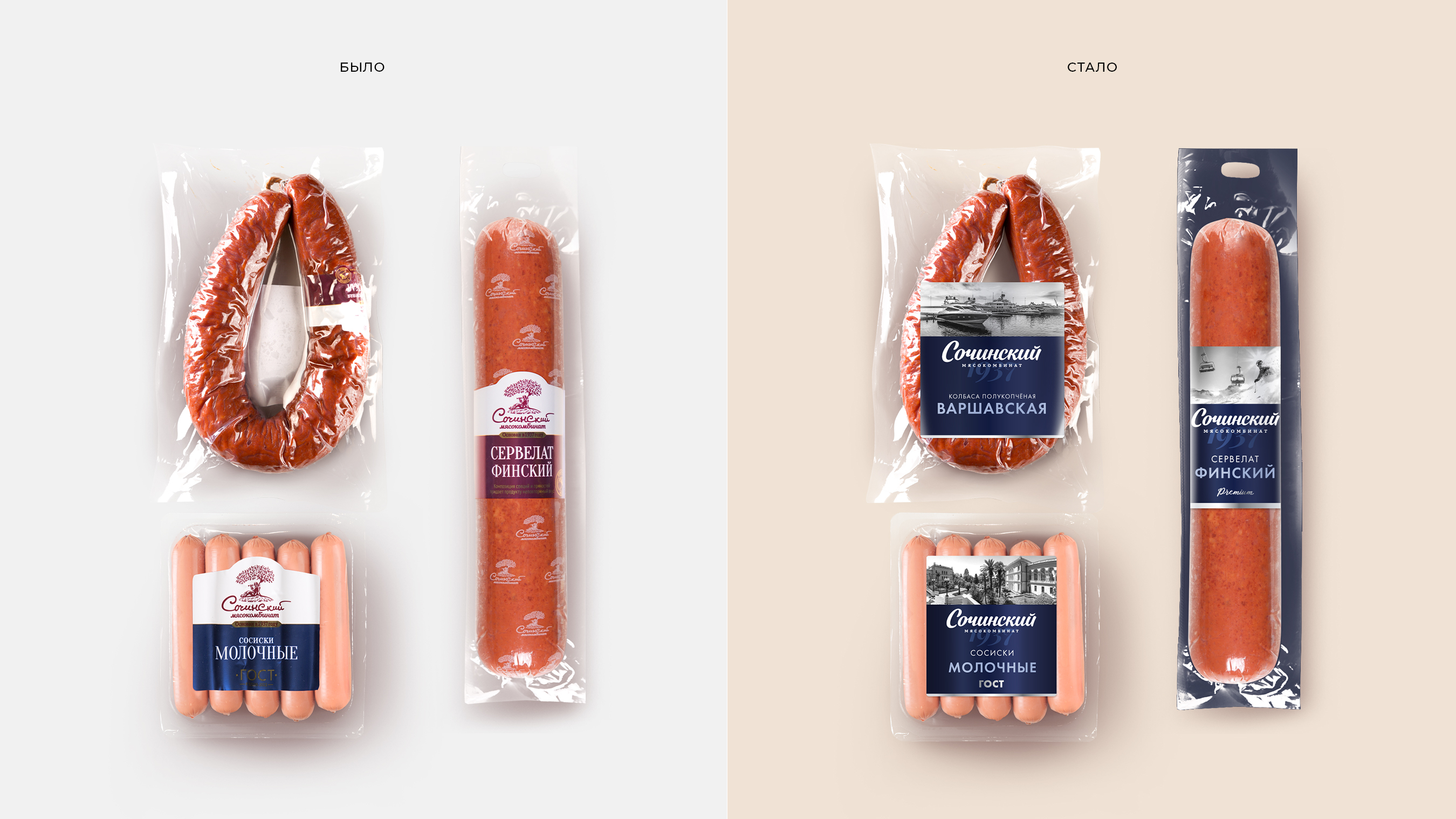
The elements of corporate identity and photography style make the brand recognizable throughout Russia.
