DECORATION is a leading Russian federal company specializing in the distribution of the largest assortment of wallpapers from leading Russian and global brands. The company offers contemporary solutions for private customers, professional designers, and architects. DECORATION is a unique lifestyle brand, a source of inspiration that awakens creativity and the desire for renewal in individuals.
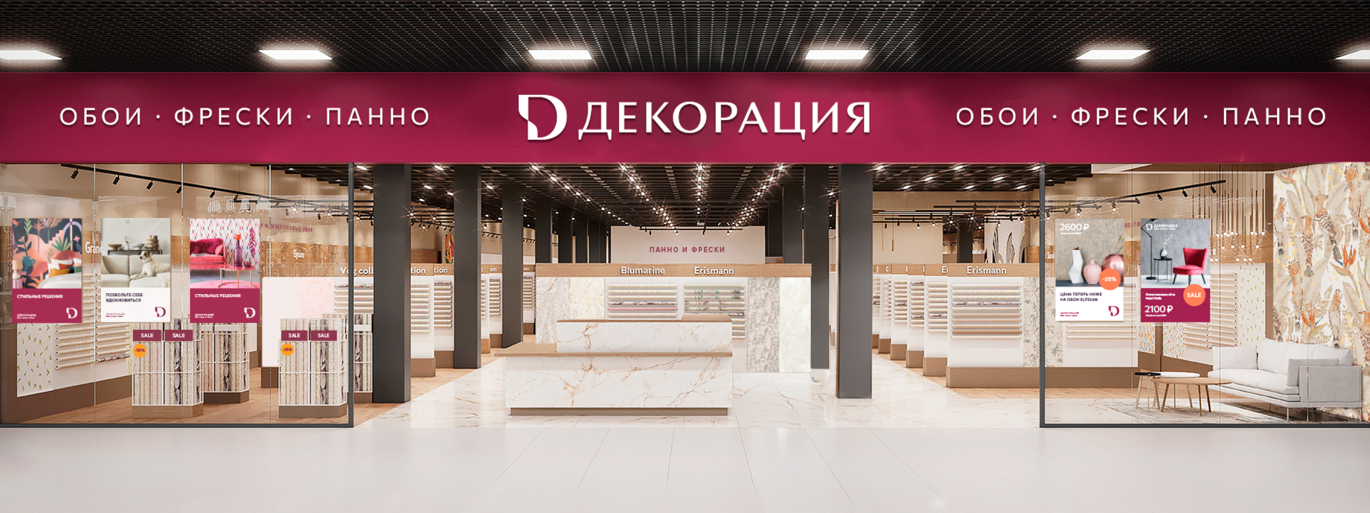
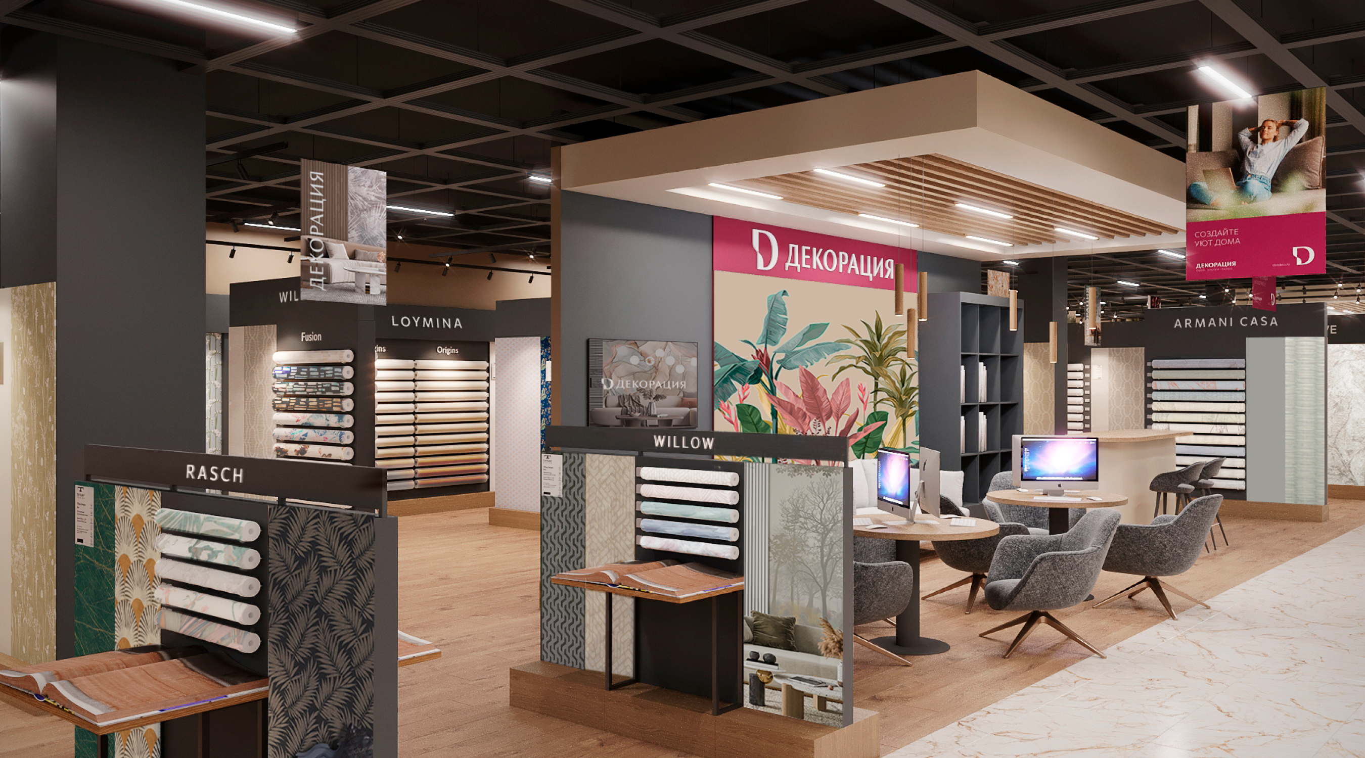
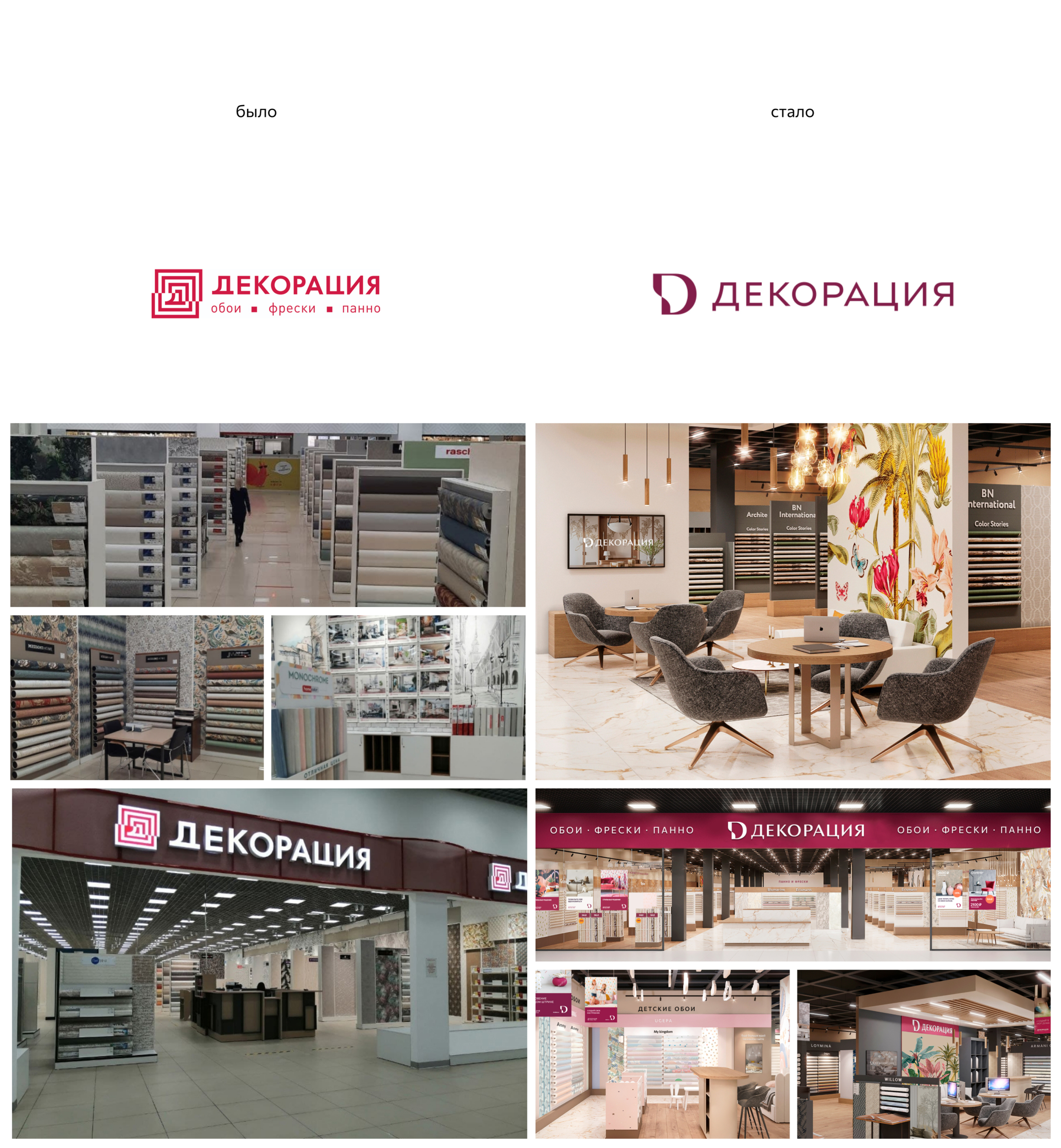
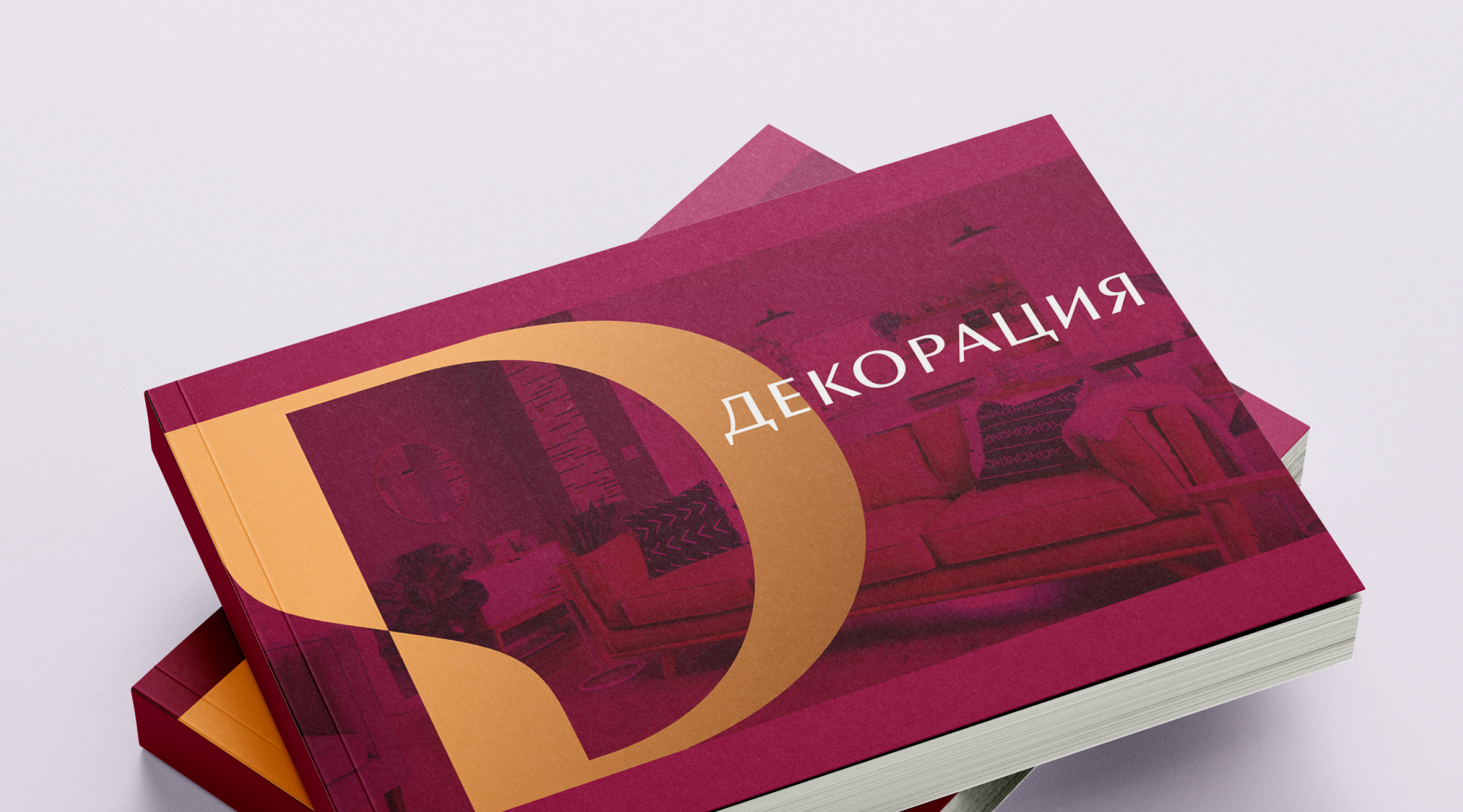
The BRANDEXPERT agency team was tasked with comprehensive rebranding, which included the brand platform, logo, and corporate style. As part of creating the retail brand, designs for retail interior, visual strategy for offline and online positioning, advertising design, and presentation materials were developed.
The agency's strategists defined the company's mission, which formed the basis of the updated brand platform: by combining consistently high quality, a rich assortment, and modern service standards, DECORATION finds individual solutions for each customer, ensuring interior design excellence and enhancing people's everyday lives for the better.
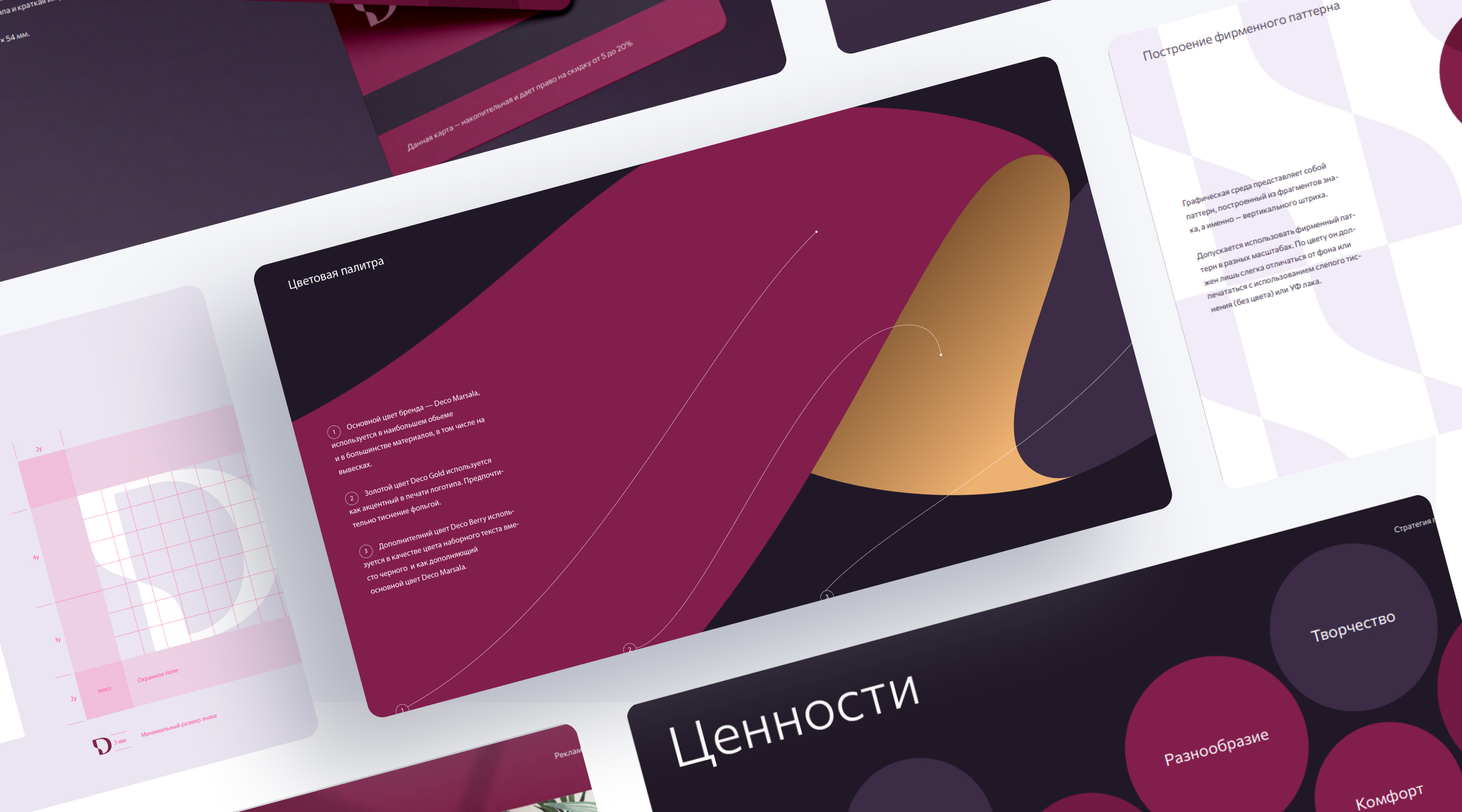
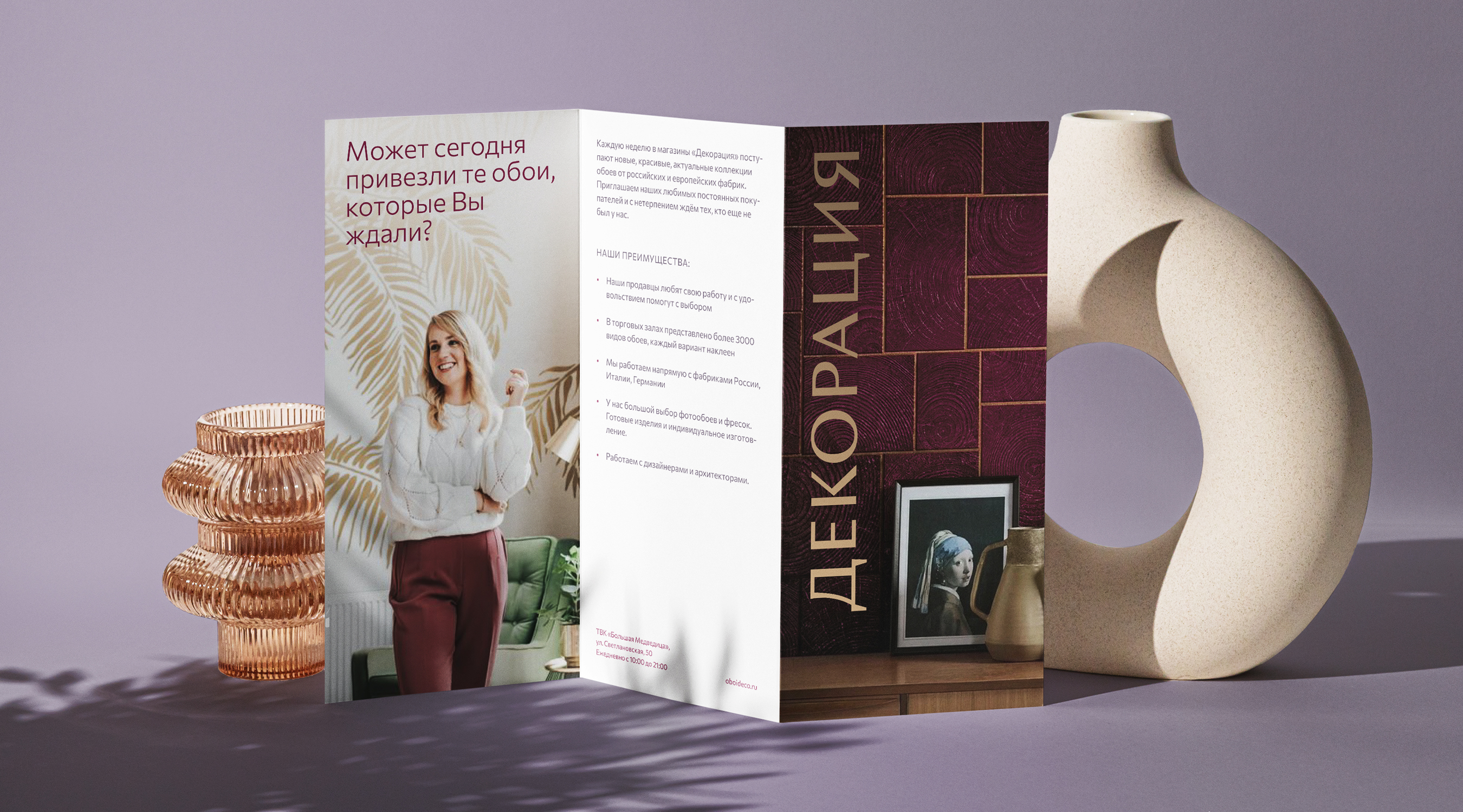
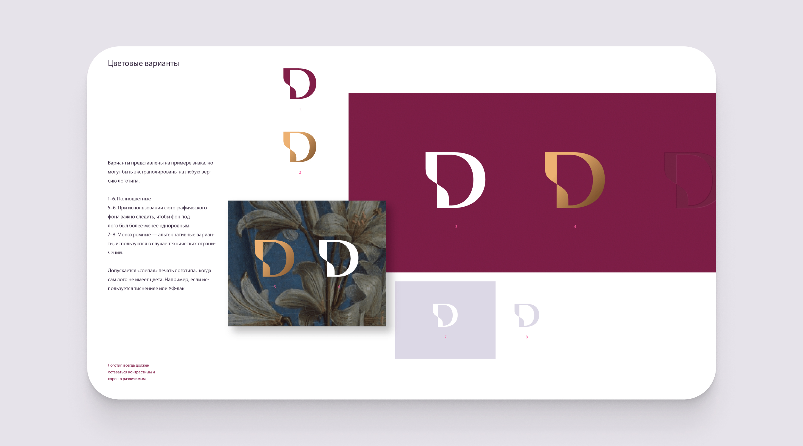
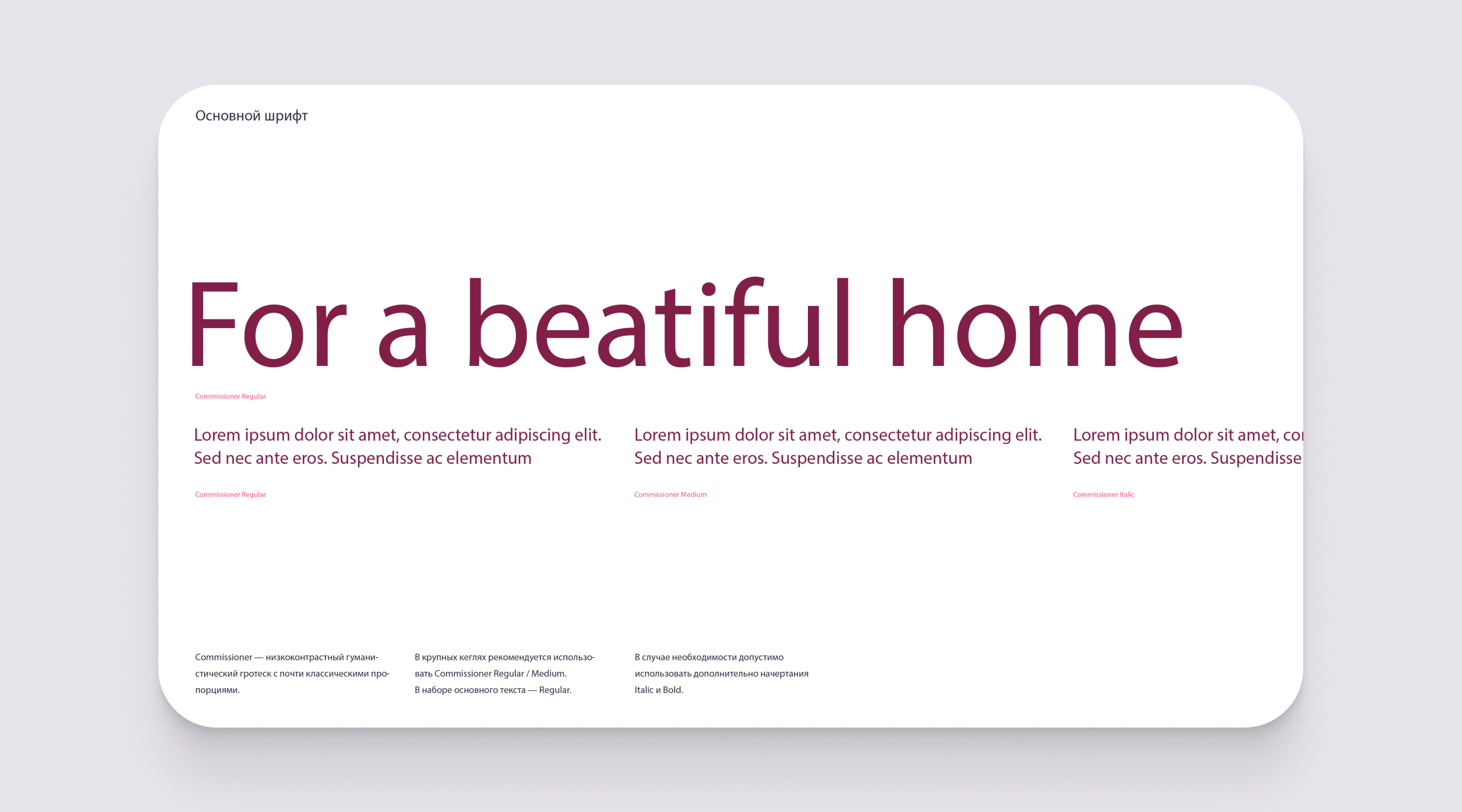
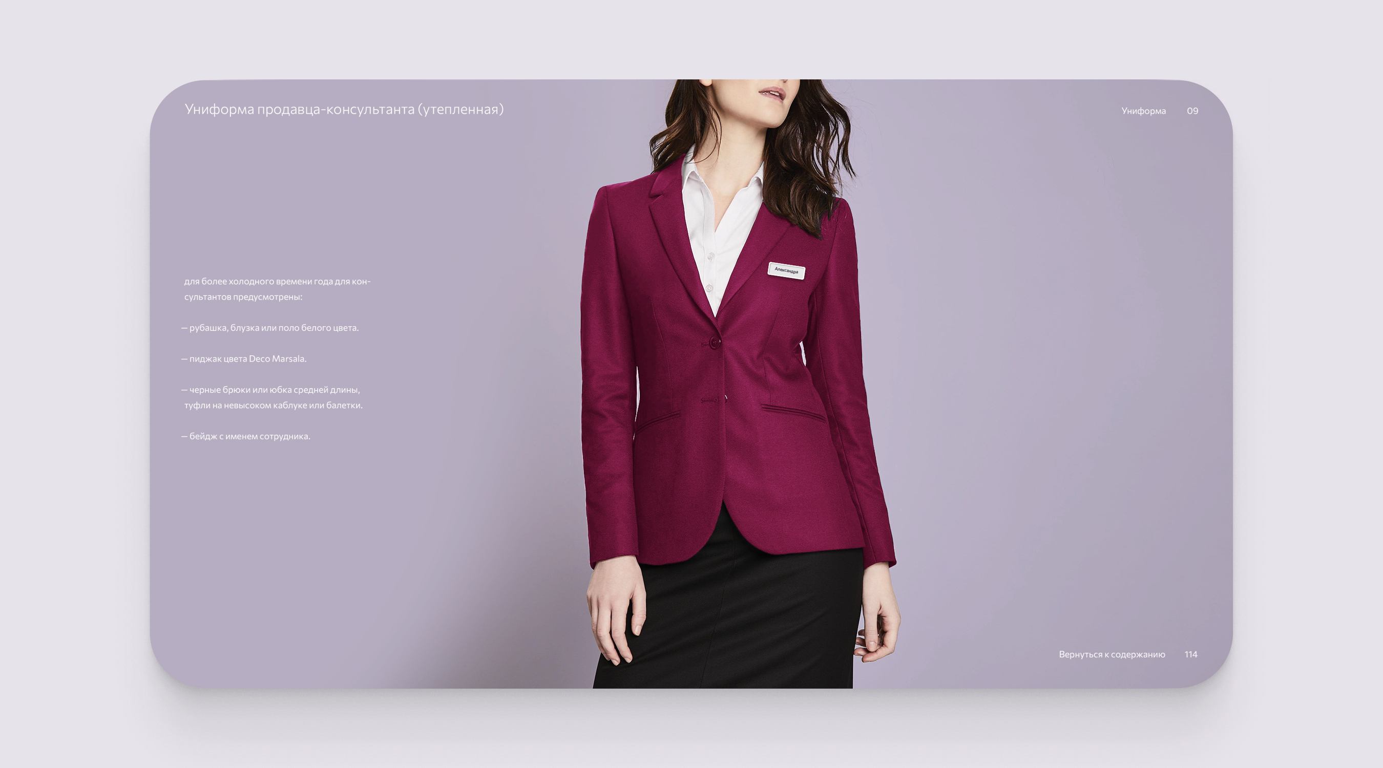
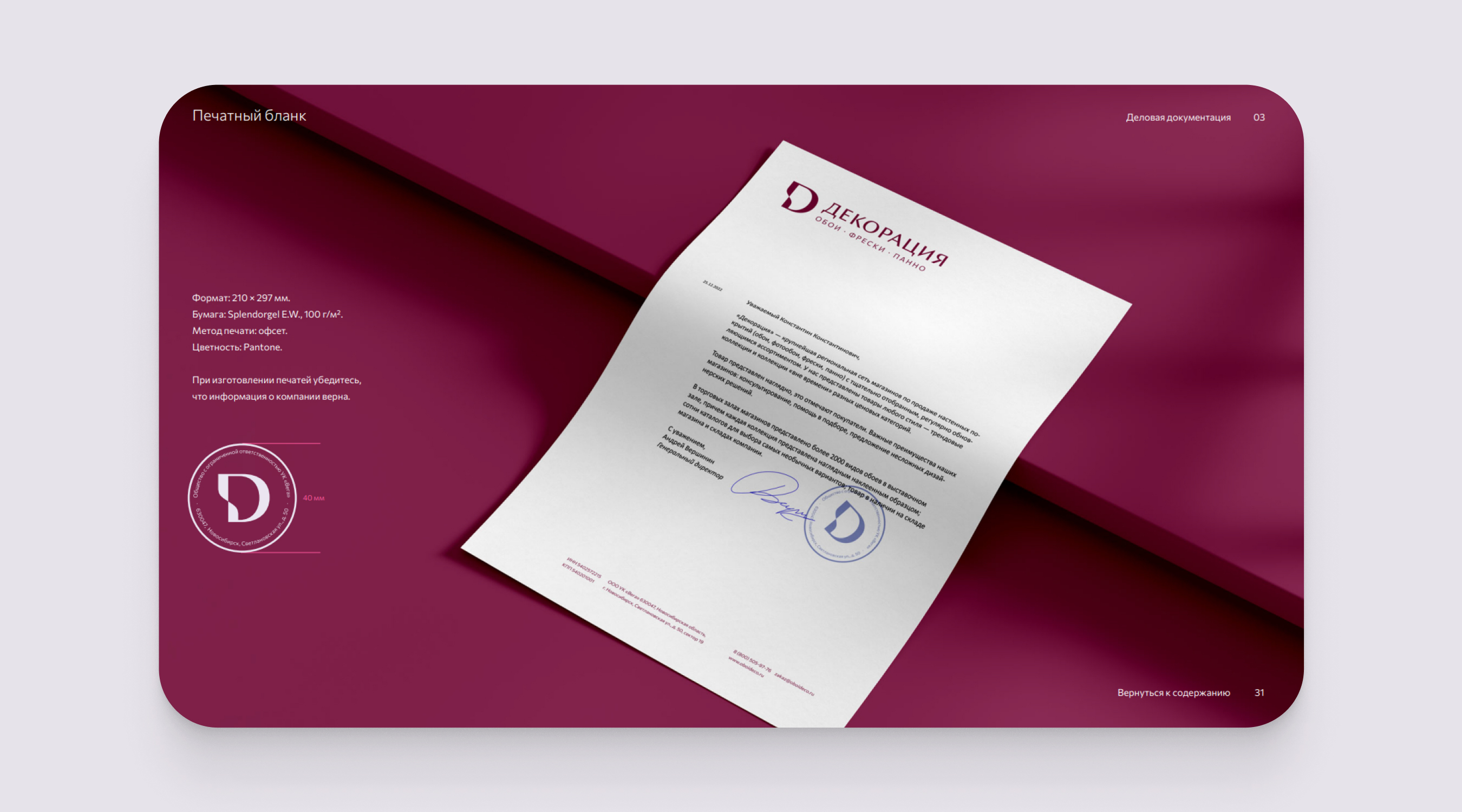
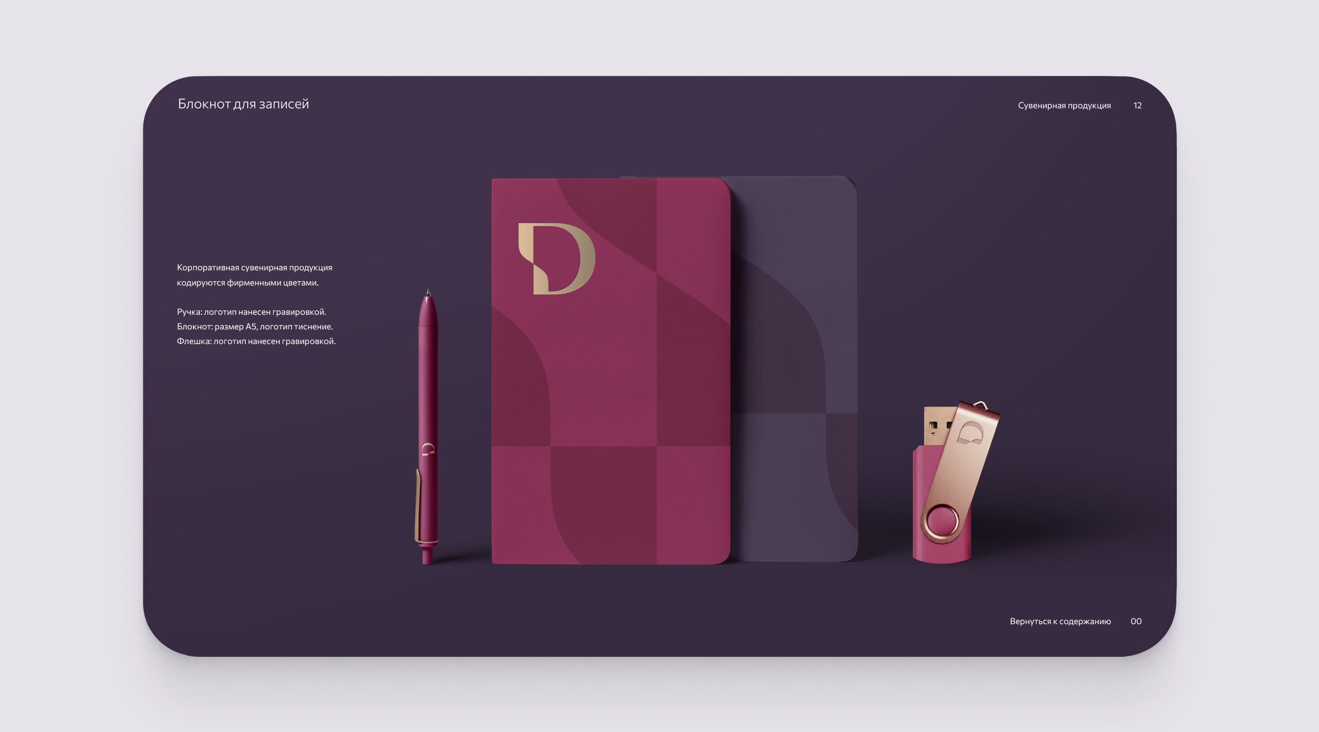
The corporate style is oriented towards creating an elegant and modern image that reflects the uniqueness and creativity of the brand, for which an original color palette has been developed. The primary brand identification color, Deco Marsala, is used in most materials, combining warm and rich shades that give the brand an elegant and cozy feel. Deco Gold is used as an accent color in the logo print, highlighting key elements in the design, emphasizing their importance and adding luxury and premium quality to the brand image. Deco Berry is used as the color for body text instead of traditional black, complementing the primary colors, enriching the palette and giving the brand an individual and deep character.
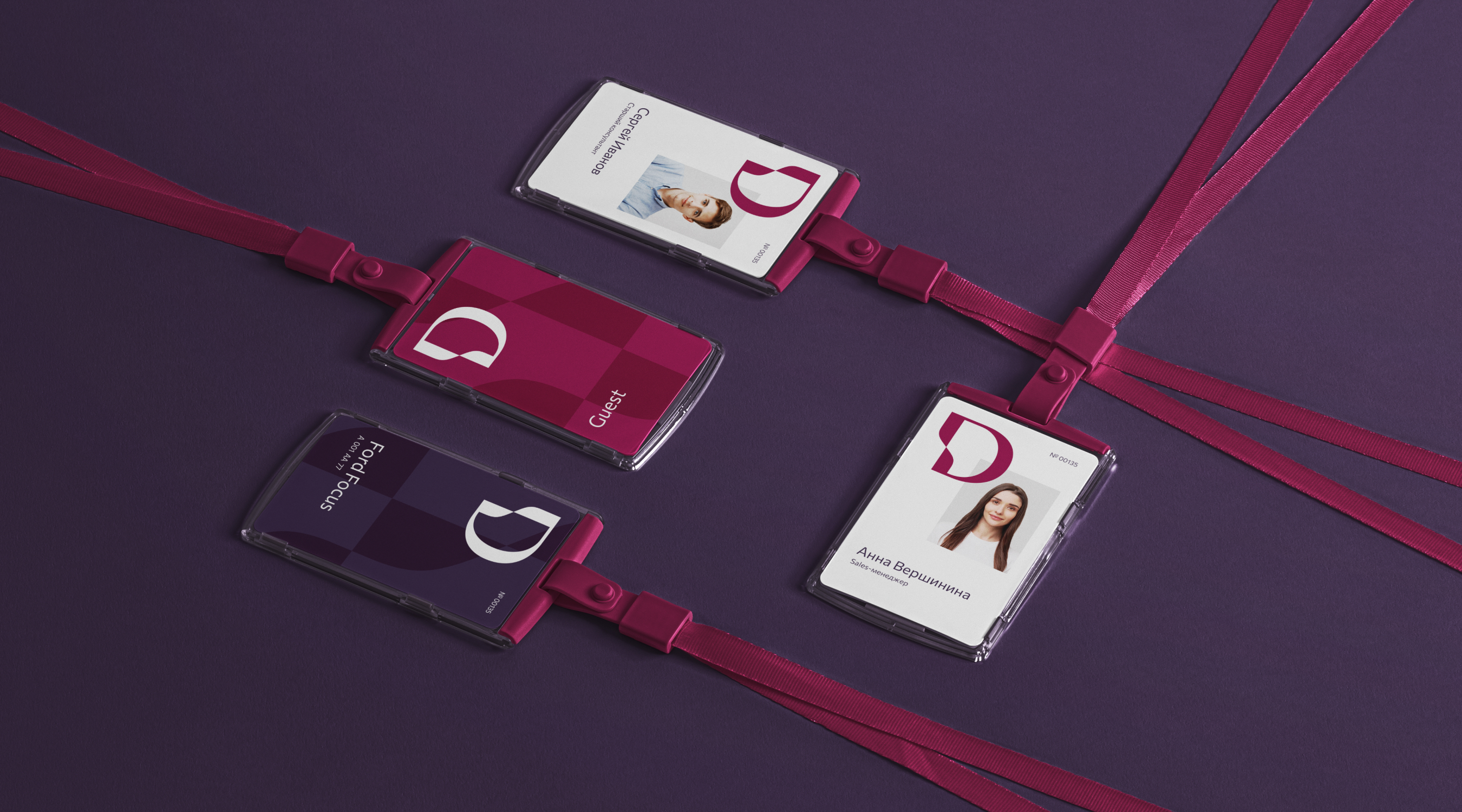
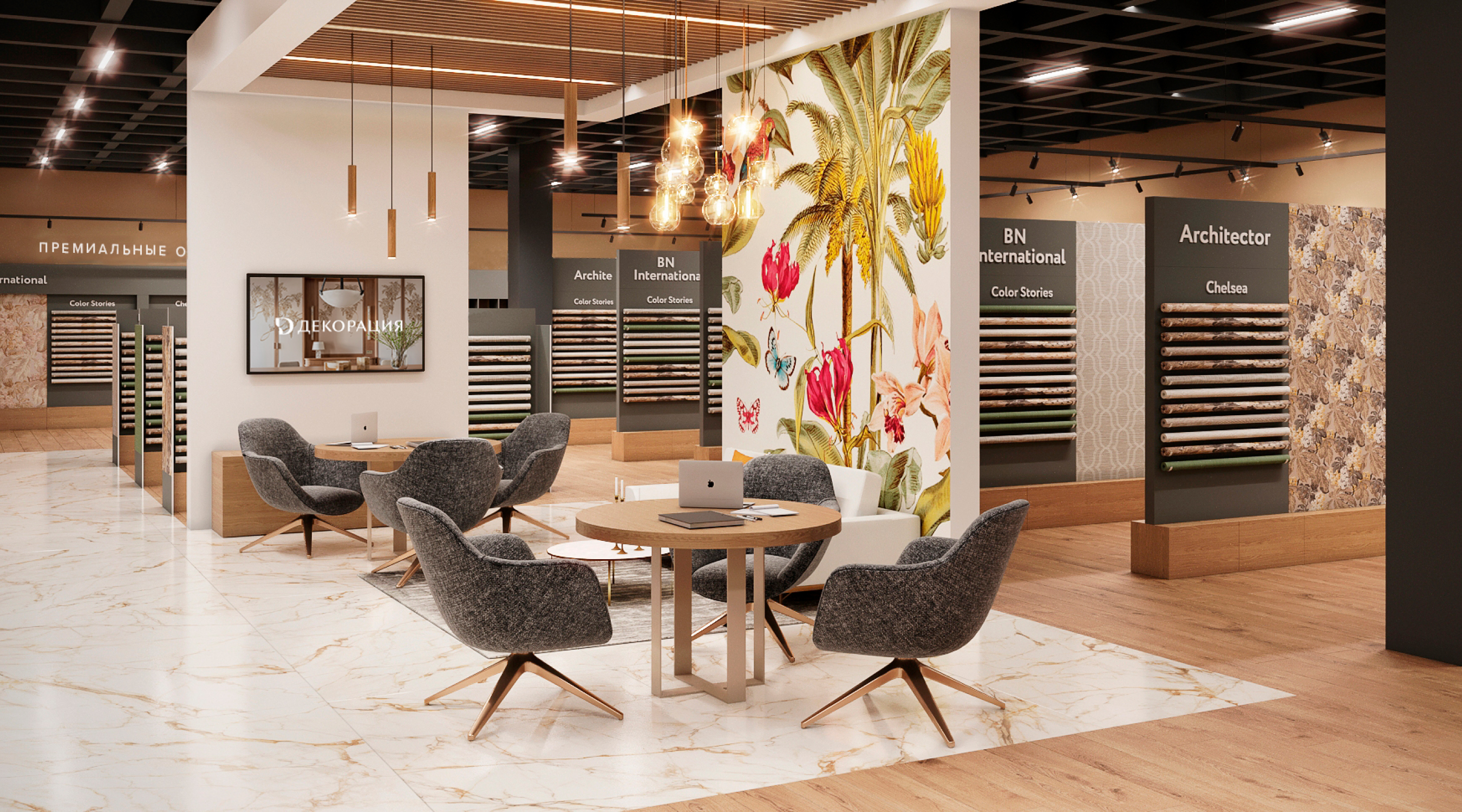
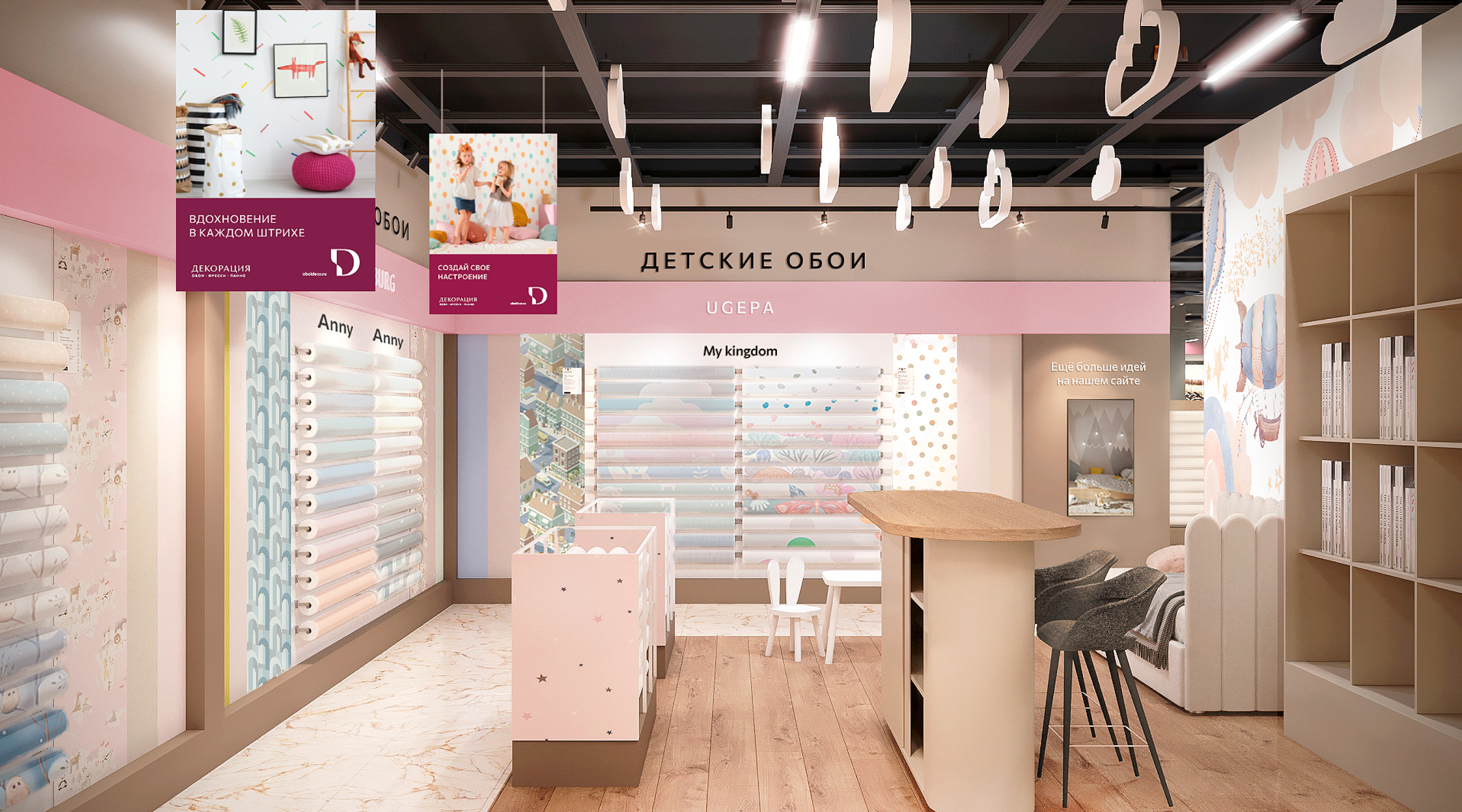
At the core of the DECORATION retail brand are new interior designs for retail spaces that create an attractive and functional environment for customers. This allows the brand to build a unique atmosphere that underscores its mission and values. The color palette of the decor is fully aligned with the brand's main colors, creating a unified and recognizable style across all locations.
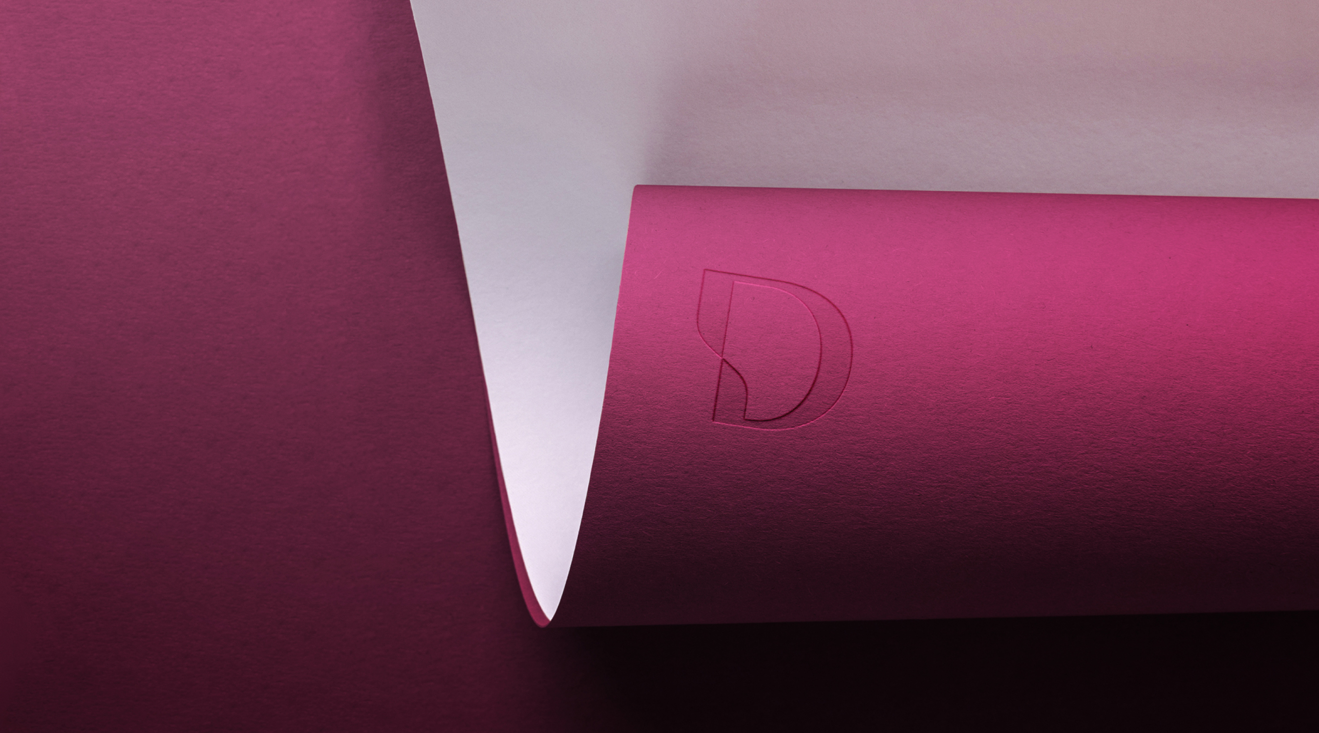
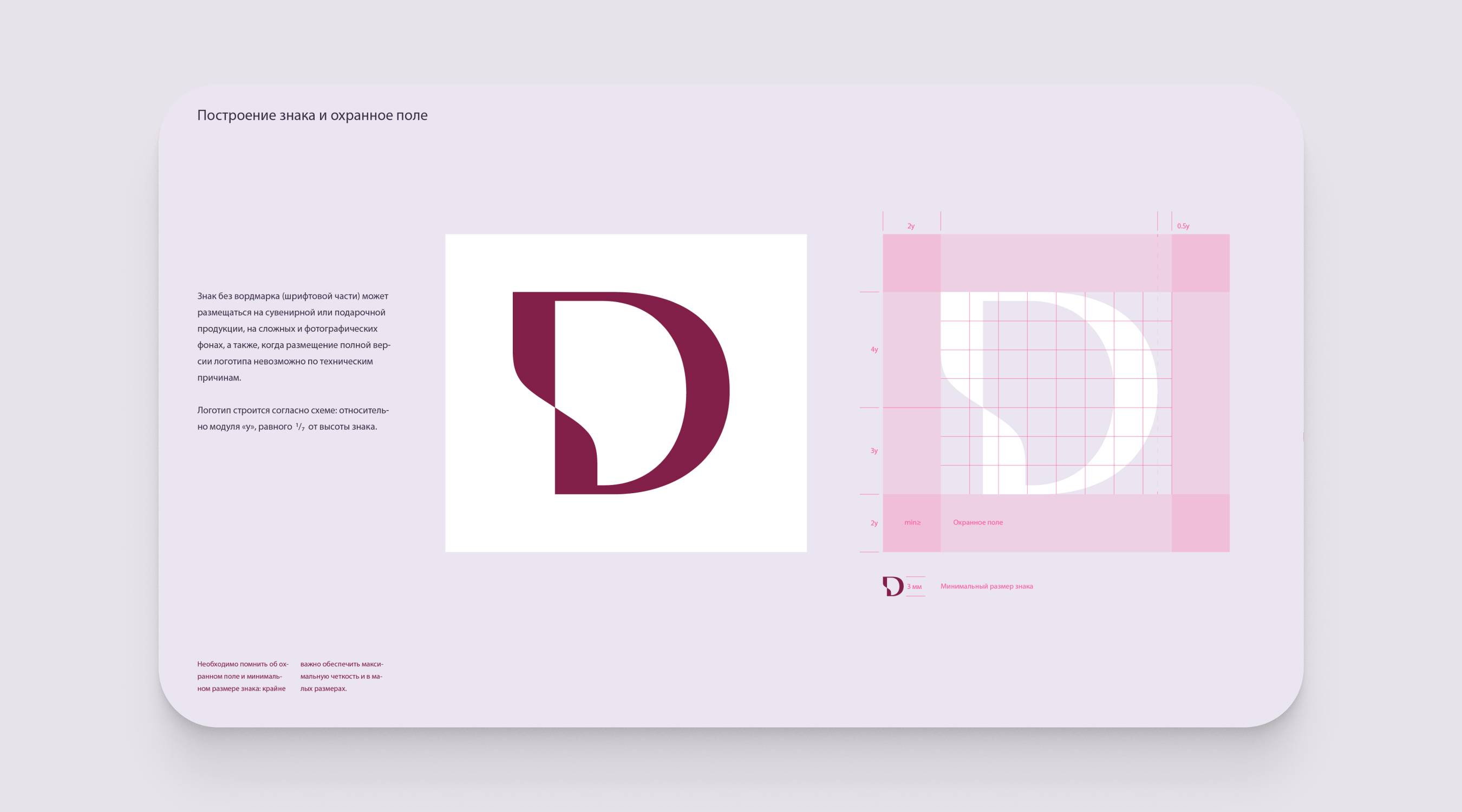
The logo and corporate style reflect the formulated mission of the brand, conveying its values and essence. The logo, as a graphic embodiment of the brand, includes a stylized element related to interior decor: the flexibility of the vertical stroke in the logo symbolizes not only the flexibility of the materials offered by the brand but also the flexibility in their selection. The turn of the stroke is a symbol of renewal, a fresh perspective.
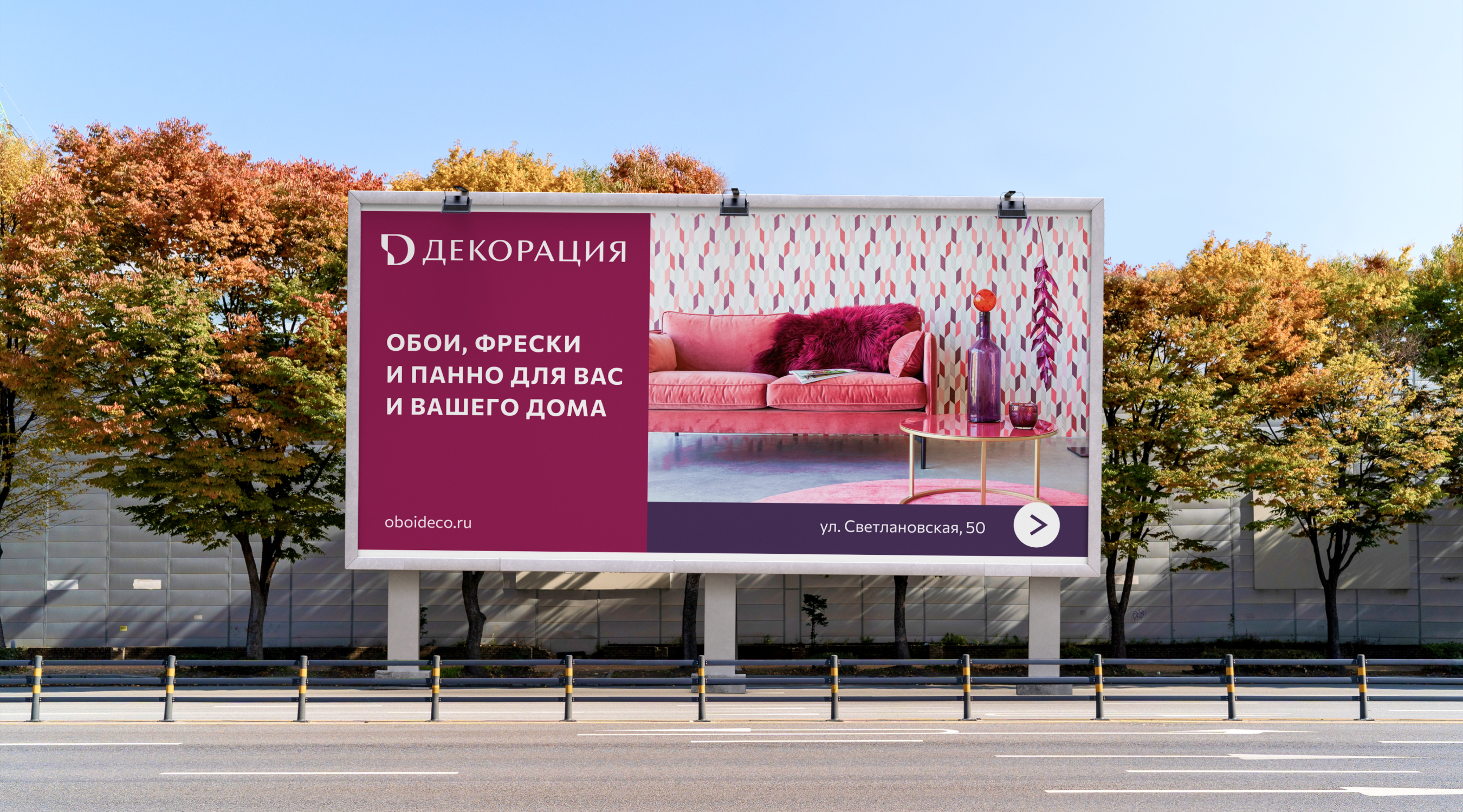
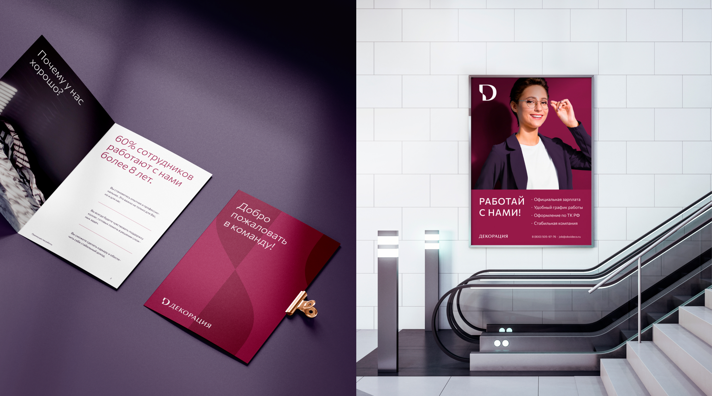
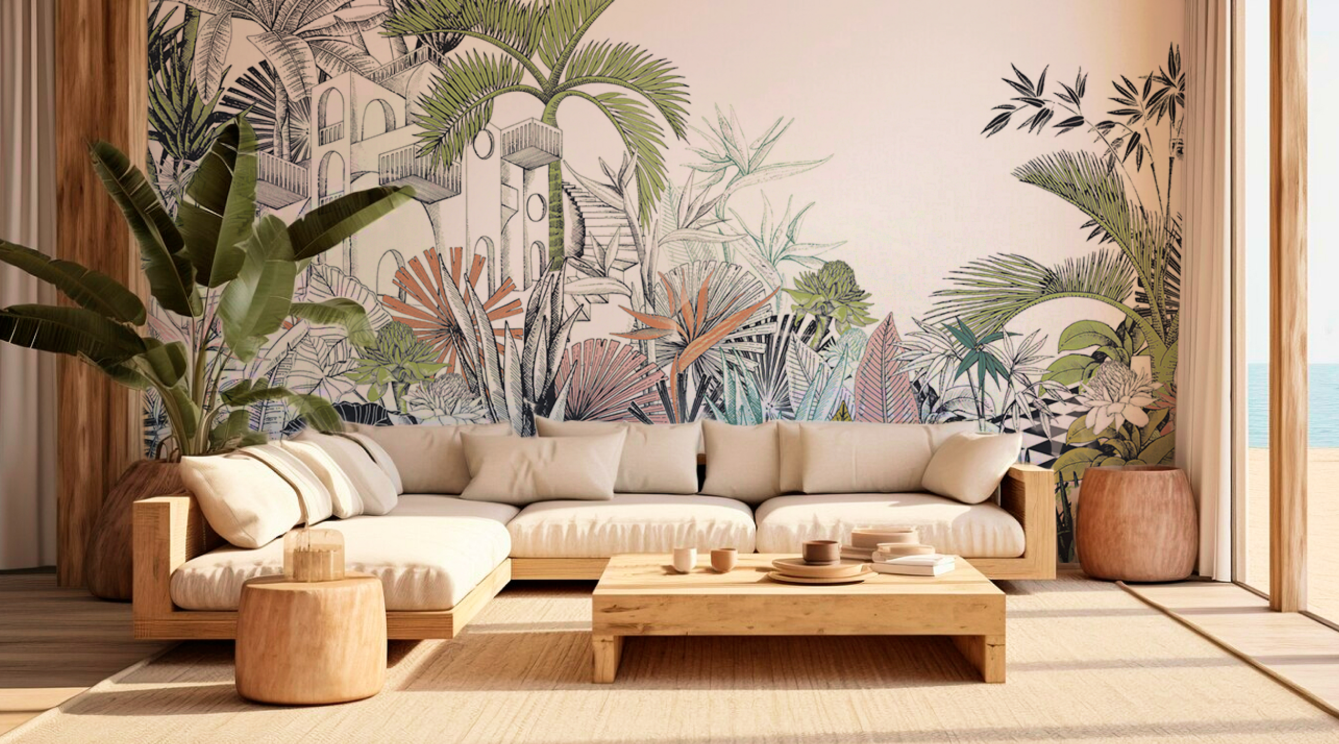

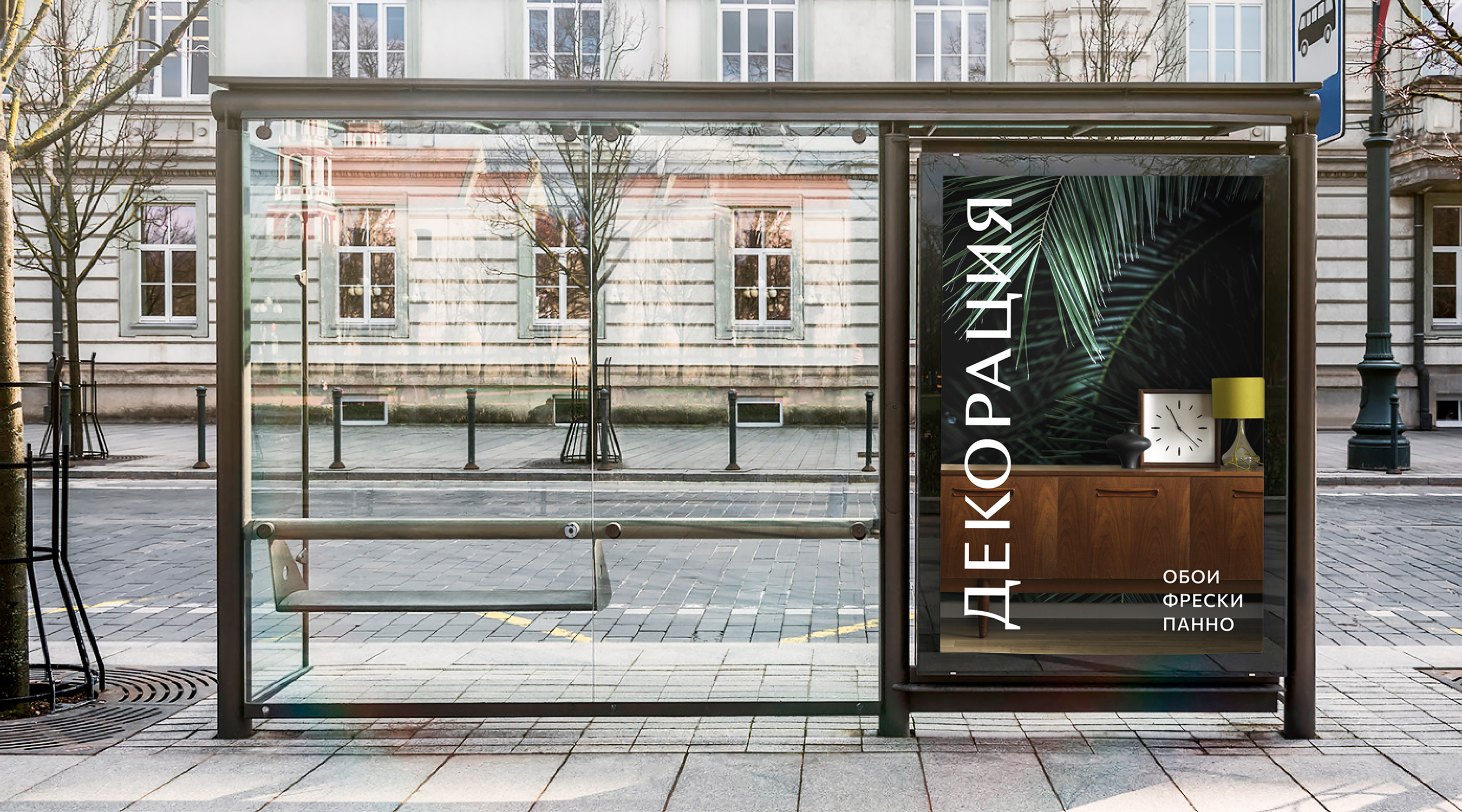
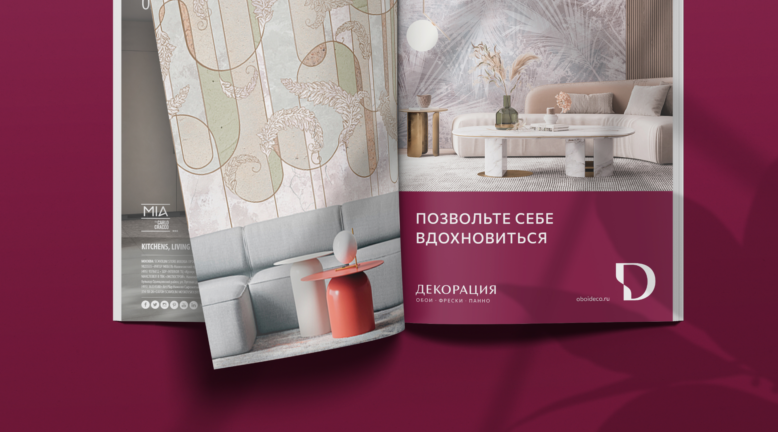
The visual strategy for offline and online positioning was developed to ensure a consistent and appealing brand perception at various customer touchpoints. For advertising and presentation materials, a modern and stylish design was created, playing a crucial role in capturing customer attention and establishing a recognizable brand image.

The comprehensive rebranding helped DECORATION strengthen its position in the market and optimize interactions with various customer segments, emphasizing its status as the brand of choice for an audience interested in design, actively updating interiors, and seeking the best solutions.
