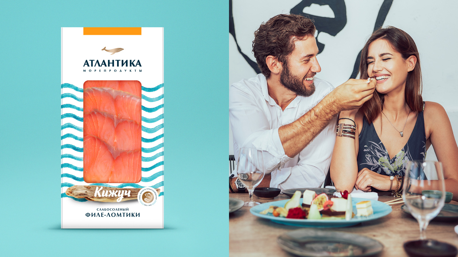
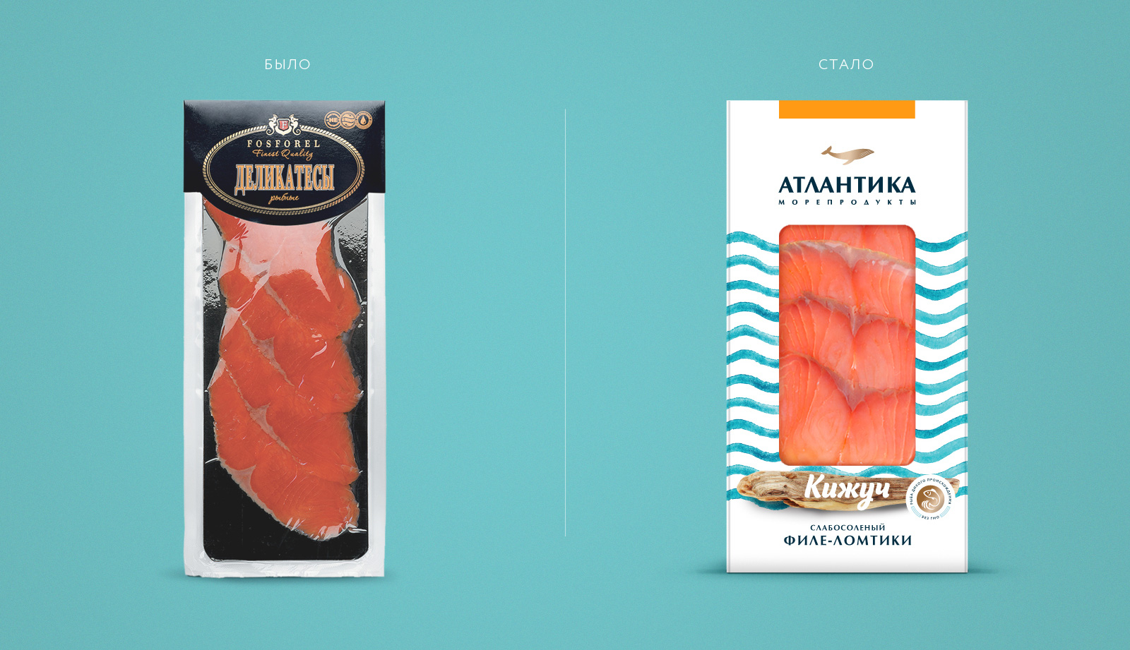
The key reasons for the rebranding were the desire to strengthen the brand's position in the market, and effectively combine under a single brand a wide range of products. The former name "Fosforel" reflected only the segment of trout (forel means trout in Russian) and did not allow the brand to sell effectively fish of other species, seafood, preserves, etc. The transition to "Atlantica" brand name allowed the brand to comprise the entire product matrix and form a strong brand with a high market potential in the "middle plus" segment.
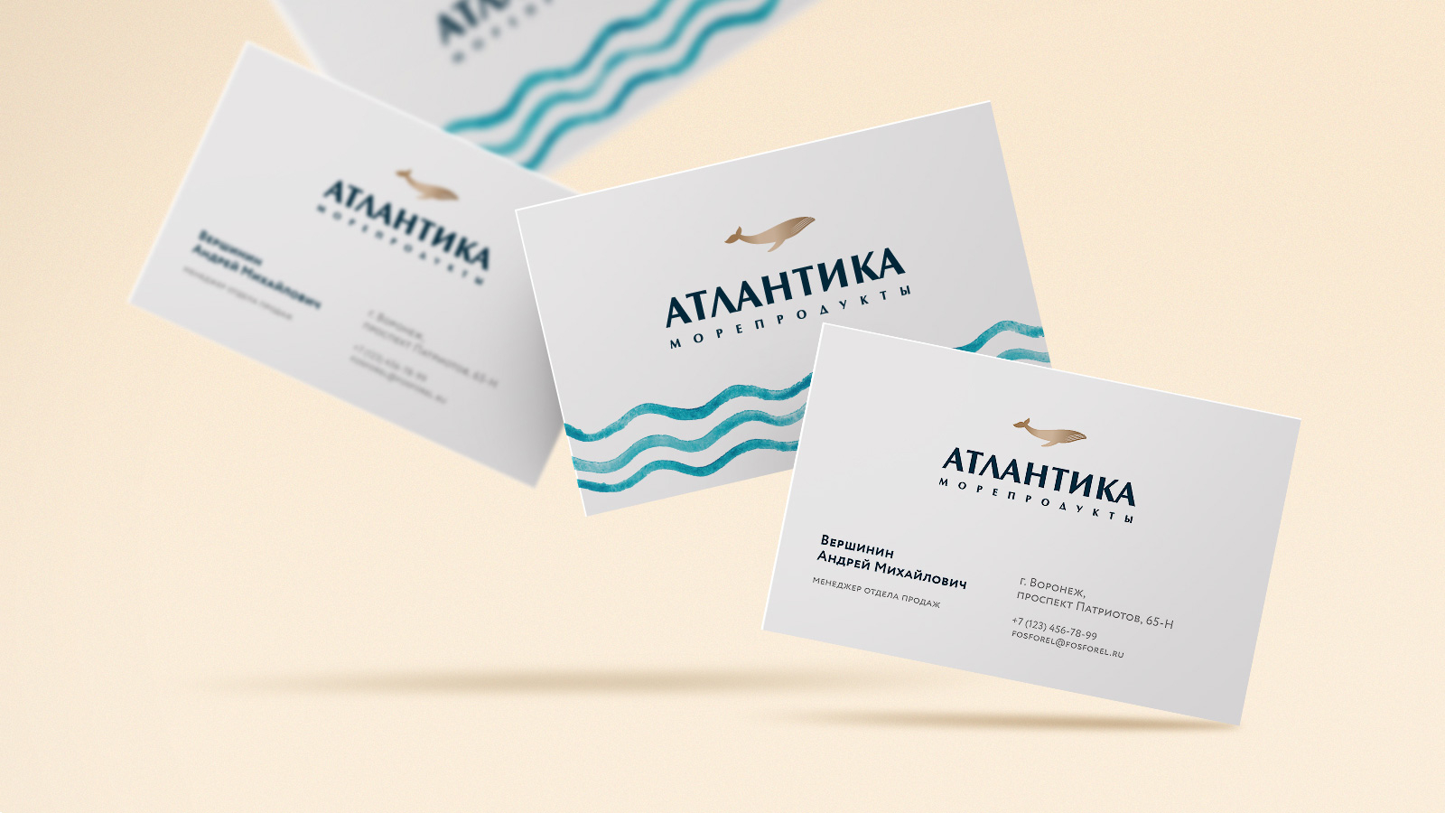
Brand’s identity creates a unique, bright, expressive, and versatile image. A unique image of the golden whale helps to focus on the exceptional quality of the product and at the same time allows the brand to grow and expand the range.
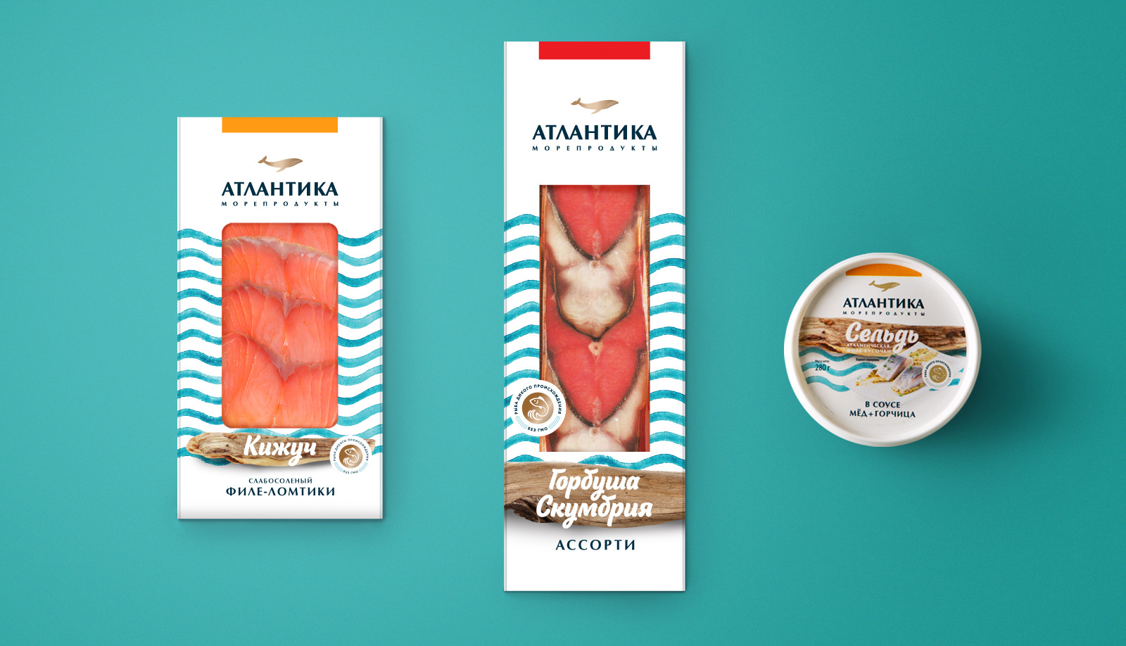
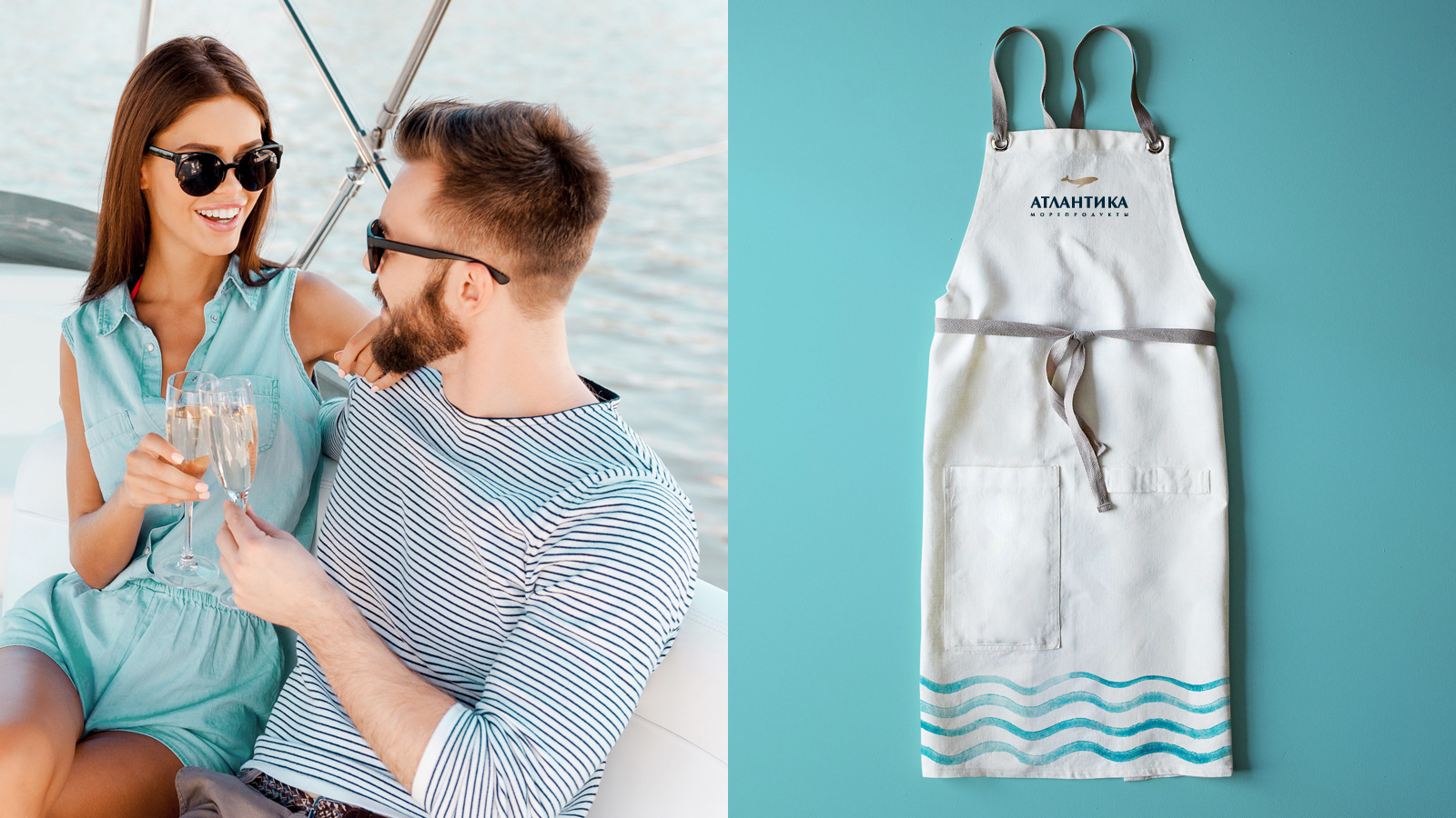
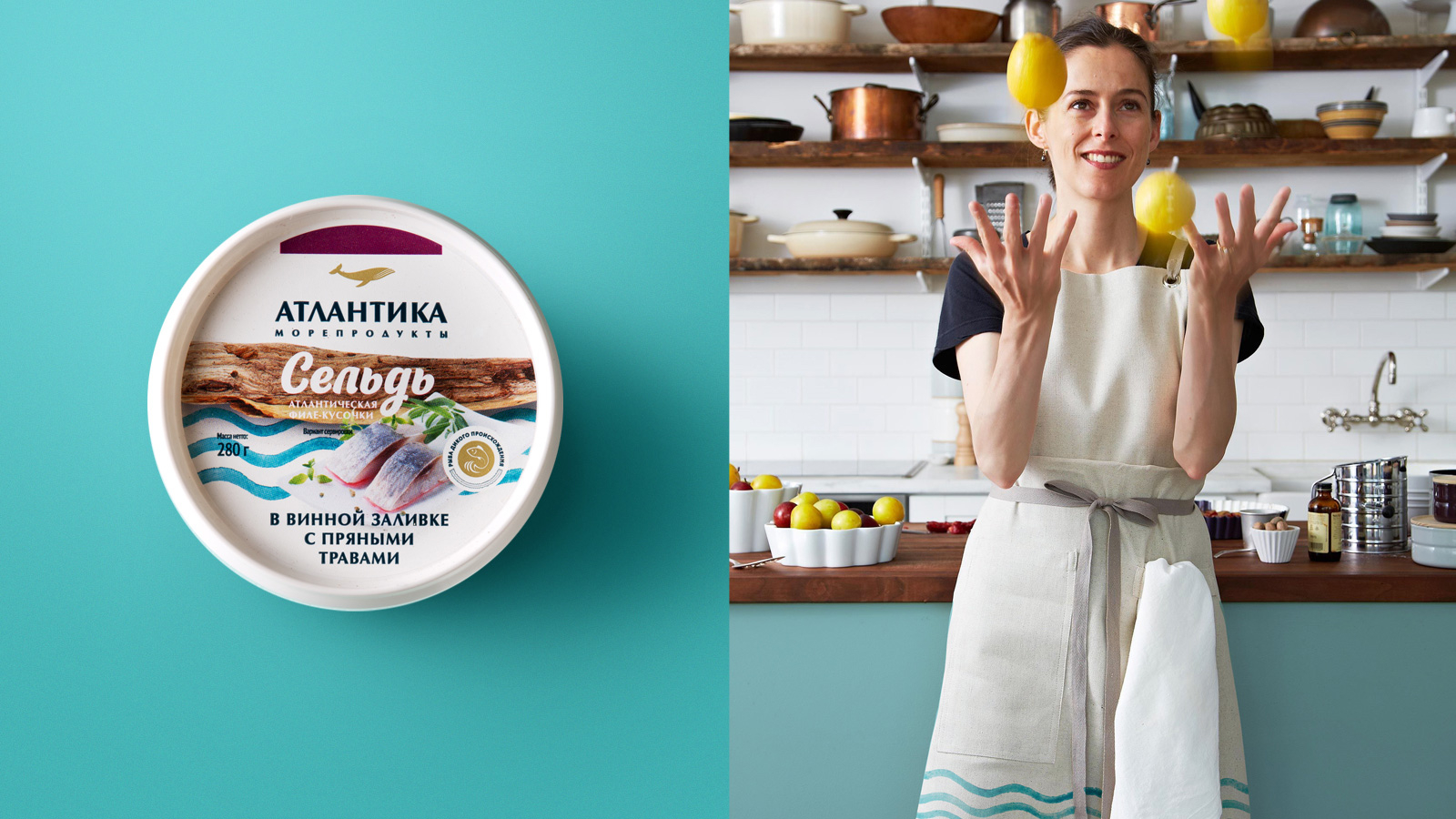
Watercolor stripes that form additional graphics at the heart of the identity form a unique memorable image of the brand and can be equally used in advertising and packaging design.
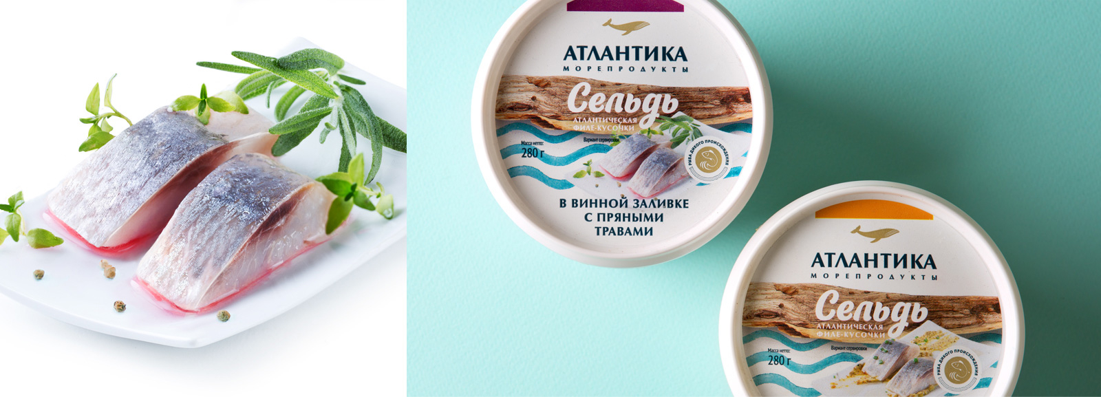
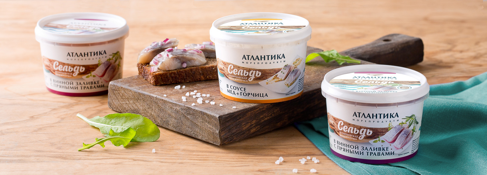
Brandexpert "The Freedom Island" has also developed a package design for the entire product matrix of the brand. The updated design is highly informative and effectively positions the brand in the strategic segment. Professional food styling makes the packaging even brighter and more attractive, allowing the consumer to make a right decision quicker.
BRANDEXPERT «Остров Свободы» / ShutterStock